Create Beautiful Responsive Photo & Video Galleries For Your Site in Minutes
Video Galleries
Audio Support
Image Downloads
Fullscreen Images
Image Proofing
Albums
ZIP File Import
Gallery Defaults
WooCommerce
Photo Proofing
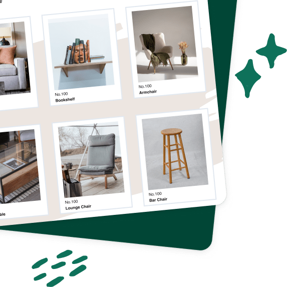
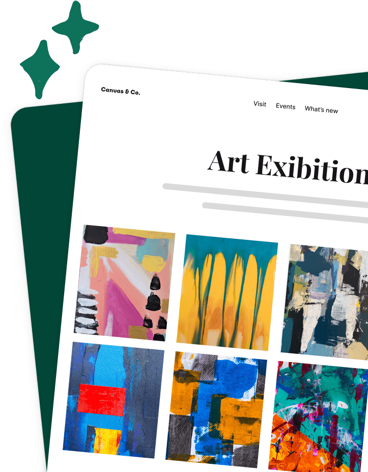
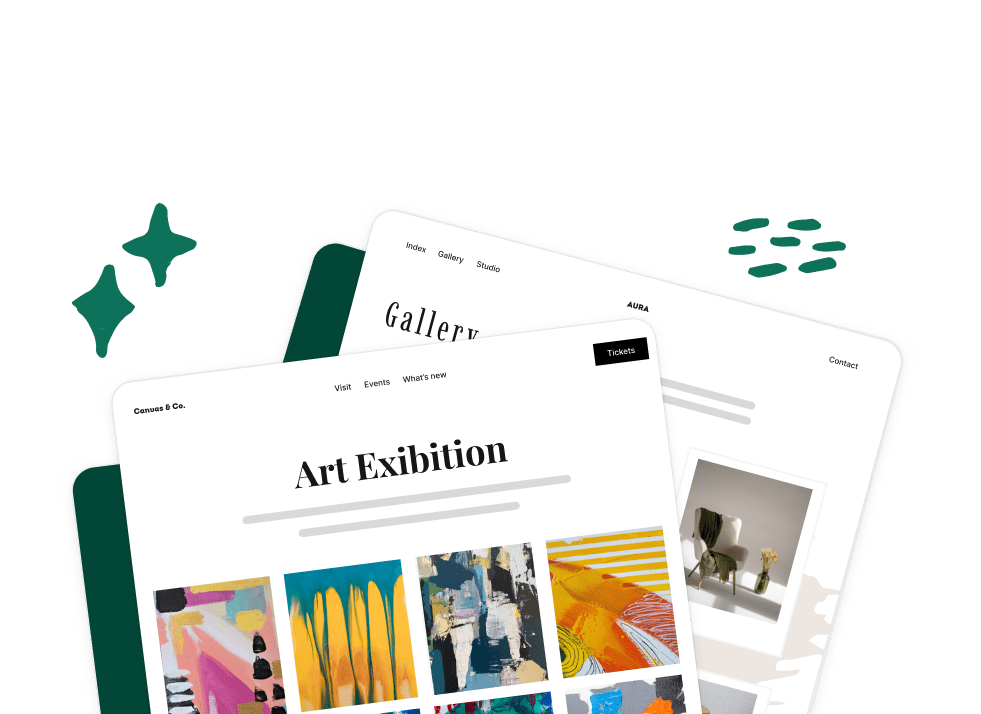
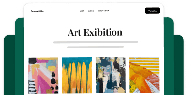
Are you looking to create a responsive gallery in WordPress? Envira takes the pain out of gallery creation and all of our galleries are 100% responsive and mobile-friendly.
All galleries created with Envira are completely responsive, mobile-friendly.
Whether your visitors view your website on a desktop, laptop, tablets, or a smartphone, your galleries will always look great.
Our gallery templates are built for cross-browser compatibility meaning that your site will work on all modern browsers.
The best part about it is that you don’t have to touch a single line of code.
Yes, we made it that simple. Our gallery creation process is entirely drag & drop, and our system is smart enough to adapt to the settings that you select and dynamically generate a mobile-friendly gallery layout.
Now you don’t have to alienate any of your users because Envira adapts to their device of choice.
Our goal is to make your images look beautiful on all devices, and our users think we do a pretty good job at it!
Copyright © [#this year :%Y] Envira Gallery, LLC. Envira Gallery is a trademark of Envira Gallery, LLC.

You're now part of our rewards program! Start earning points and rewards with every purchase.
Start shoppingCreate a free account to start earning points and unlocking member-only perks.
Already have an account?
Welcome back! Sign in to access your rewards.
Don't have an account?
Share your link with friends. They get a reward and you earn one when they purchase.
You were sent a gift
You have received
Use at checkout on your first order
Enter your email to claim it now.
Already have an account?
No rewards available to redeem at this time.
Check back later for new ways to use your points.
Already have an account?
Requires an account to redeem
Redeem rewards now
Turn your into discounts and perks
Instant setup
One click and you're ready to go
Redeemed
Use this coupon on your next order
Free product applies automatically.
Start earning to unlock your first reward
This product is currently out of stock
Your reward will remain available when the product is back in stock.
Free product applies automatically.