Would you like to customize lightbox arrows with Envira? You can easily do this with just a little CSS. We’ll walk you through the CSS needed to change lightbox arrows.
This tutorial is a little more technical then the other docs and will require a basic level of CSS.
Setup
Step 1 – Create or edit your gallery
Your first step is to create a new gallery or edit an existing one. You can follow along with our documentation for creating your first gallery.
Step 2 – Install and activate the CSS Addon
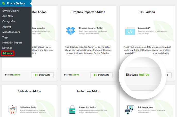
In your next step you’ll need to install and activate Envira’s CSS Addon. Navigate to the Addons section and click Install then Activate on the CSS Addon.

Step 3 – The CSS
Below is the CSS we’ve used in our demo.
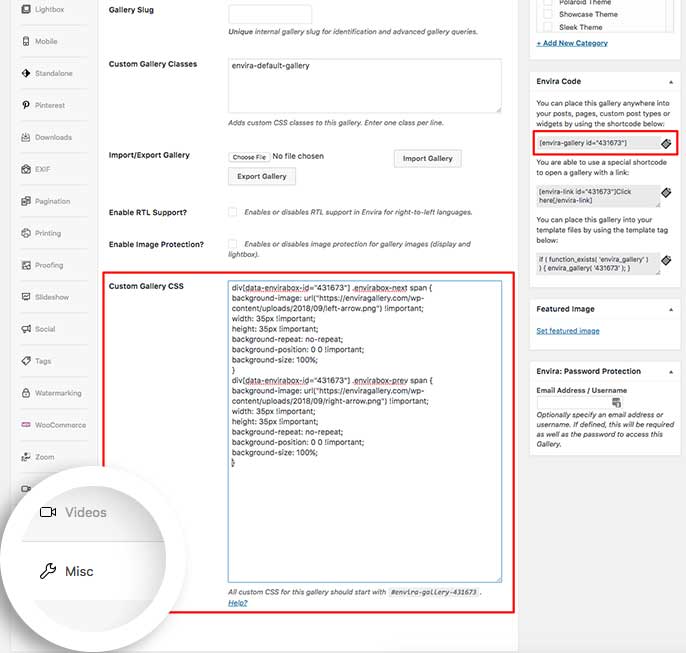
You’ll need to change this ID number to match your gallery ID number. You can find this by looking in the sidebar of your gallery edit screen.
For more information on how to find your gallery ID number you can read this article.
You can also just add this CSS to the WordPress Customizer to make this change for all of your Envira Galleries!
To find out more about the WordPress Customizer, please review our article on How to add custom CSS to the WordPress Customizer.
If you’re using the CSS Addon to only change 1 gallery, add your CSS to the Misc tab inside the Custom Gallery CSS box.

Once you’ve added your CSS just click Publish or Update to save the changes to the gallery.
div[data-envirabox-id="431673"] .envirabox-next span {
background-image: url("https://example.com/images/envira-arrows.png") !important;
width: 35px !important;
height: 35px !important;
background-repeat: no-repeat;
background-position: 0 0 !important;
background-size: 100%;
}
div[data-envirabox-id="431673"] .envirabox-prev span {
background-image: url("https://example.com/images/envira-arrows.png") !important;
width: 35px !important;
height: 35px !important;
background-repeat: no-repeat;
background-position: 0 0 !important;
background-size: 100%;
}
Be sure to change https://example.com/images/envira-arrows.png to the URL of each arrow images you wish to replace the default ones with in the example below.
Depending on the size of the images you choose, you may need to adjust the CSS to get the look just right.
Check out our demo of this in action!
And that’s it! Using CSS there’s so much more you can do! Check out our article on How to Customize the Lightbox Close Button.
FAQs
Why isn’t the CSS working for me?
A: The Base (Dark) and Base (Light) lightbox themes use a font-based icon instead.
Can I use a font-based icon instead?
A: Absolutely! Using CSS you can easily replace the background images with a font-based icon if you wish.
The CSS for this is a little more technical and would require some skilled knowledge of CSS. The CSS may look something like this:
div[data-envirabox-id="431673"] .envirabox-next span {
background-image: none !important;
}
div[data-envirabox-id="431673"] .envirabox-prev span {
background-image: none !important;
}
div[data-envirabox-id="431673"] .envirabox-next span:before {
content: "f519";
font-family: 'dashicons';
}
div[data-envirabox-id="431673"] .envirabox-prev span:before {
content: "f518";
font-family: 'dashicons';
}
Using a child theme you can add a function to your child theme’s functions.php to include the WordPress Dashicons font like this:
add_action( 'wp_enqueue_scripts', 'load_dashicons_front_end' );
function load_dashicons_front_end() {
wp_enqueue_style( 'dashicons' );
}

