
Photoshop adjustment layers are a great way to learn in depth, layer based editing. Gradient maps are one of these adjustment layers, and they allow you to creatively color grade images. How can you apply and best utilize gradient maps in Photoshop CC?
There are two main ways you can use Photoshop CC’s Gradient maps tools. You can color grade images as an overlay, and color replace an image with multiple, usually two, tones. Color replacing includes black and white images, but this tool allows you to choose any two colors rather than the base two tonalities.
You can also use gradient maps to create a gradient between two colors, which you can then use rather than black and white.
Gradient maps give you more control over contrast and mood in turning photos black and white, too.
We’ll cover the following in this guide:
- What are Photoshop CC Gradient Maps?
- How do You Use Photoshop CC Gradient Maps?
- What are the Best Uses for Photoshop CC Gradient Maps?
We’ll discuss both general advice and step by step edits, so let’s jump right in!
Before we begin, make sure you have Photoshop downloaded on your device. You can purchase Photoshop through Adobe’s Creative Cloud plan for only $9.99/month.
What are Photoshop CC Gradient Maps?
Gradient maps are a Photoshop CC tool that creates a new adjustment layer which choose a new color for each pixel of a certain value. In layman’s terms, the darkest areas of your gradient replace the shadows and below of your image, the middle replaces your general exposure, and the end replaces your highlights.
If you are looking to figure out basic color grading using Gradient Maps, check out this tutorial. Further good tutorials include this one, that uses both Gradient Maps and Blending Modes.
How do Gradient Maps Work?
Take this image, for example:
If we apply a basic Gradient Mask to this layer, using a black to white gradient, this is what we get:
This is pretty easy to understand in black and white. The dark areas are more black, the light areas are more white, and the middle areas are gray. Let’s look at a color example with a weird gradient.
This is the same image above, run with a red to green Gradient Map to show maximum contrast:
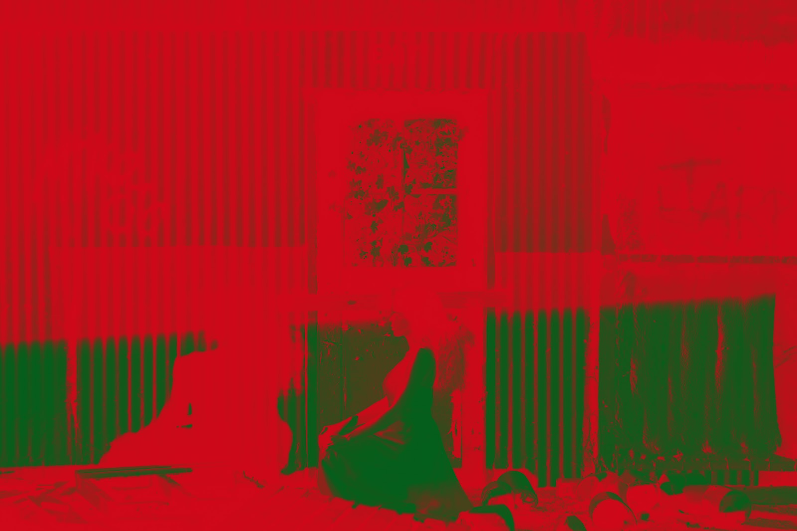
Notice how the areas that were the darkest in the image above are now a harsh red. Other areas, outside of shadows, are bright green. The gradient between red and green is muddy, so the less saturated areas are the midtones.
Why Use This Tool?
While the example above shows extreme color difference, there are many reasons to use these effects. Color grading isn’t always a solid color overlay, and later on we’ll see that Gradient Maps are really adjacent to Blending Modes.
There are also specific photography options that make this tool super easy to use. These are hidden in drop-down menus. We’ll discuss how to access them later on.
Lastly, if you are someone that loves their black and white photography, Gradient Maps allow a new level of manual control that you did not have access to before, as well as the option of more creative gradients. For example, you can go from black to white and back to black in an image, for a much more abstract look.
Where is the Gradient Map Tool?
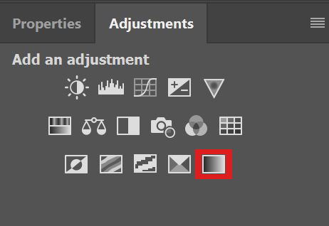
You can use the Gradient Map Tool in several ways. Once you have an image in photoshop, the easiest way to select it is to go to Image >> Adjustments >> Gradient Map.
You can also select it from the Adjustments panel:
To make this Adjustments panel visible, go into your top level drop-down menus. Select Window >> Adjustments, and make sure that “Adjustments” is checked in the list.
If you’re working in the Photography Workspace, this setting comes pre-selected. To access the Photography Workspace, choose Window >> Workspaces >> Photography.
How to Use Gradient Maps in Photoshop CC
Now that you understand the basics of what Gradient Maps do in Photoshop, you can start using them for creative experimentation. There are several different ways to apply layer mask so that they color grade your images properly, without aggressively replacing your image.
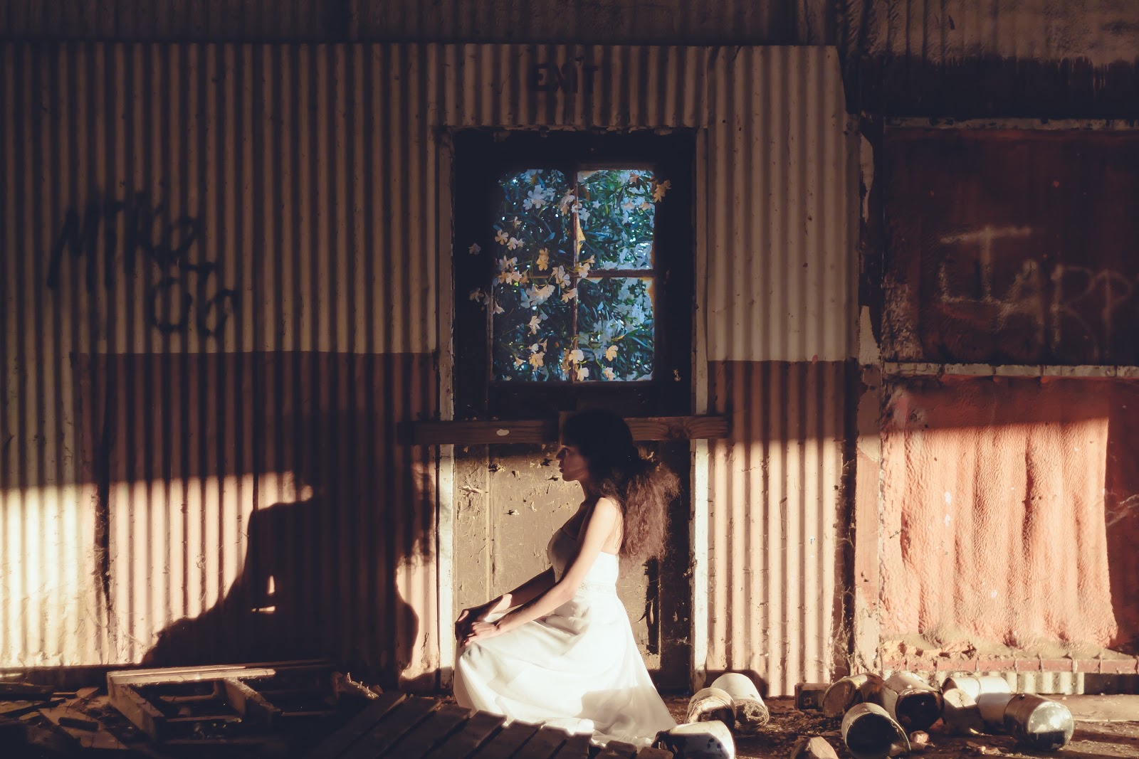
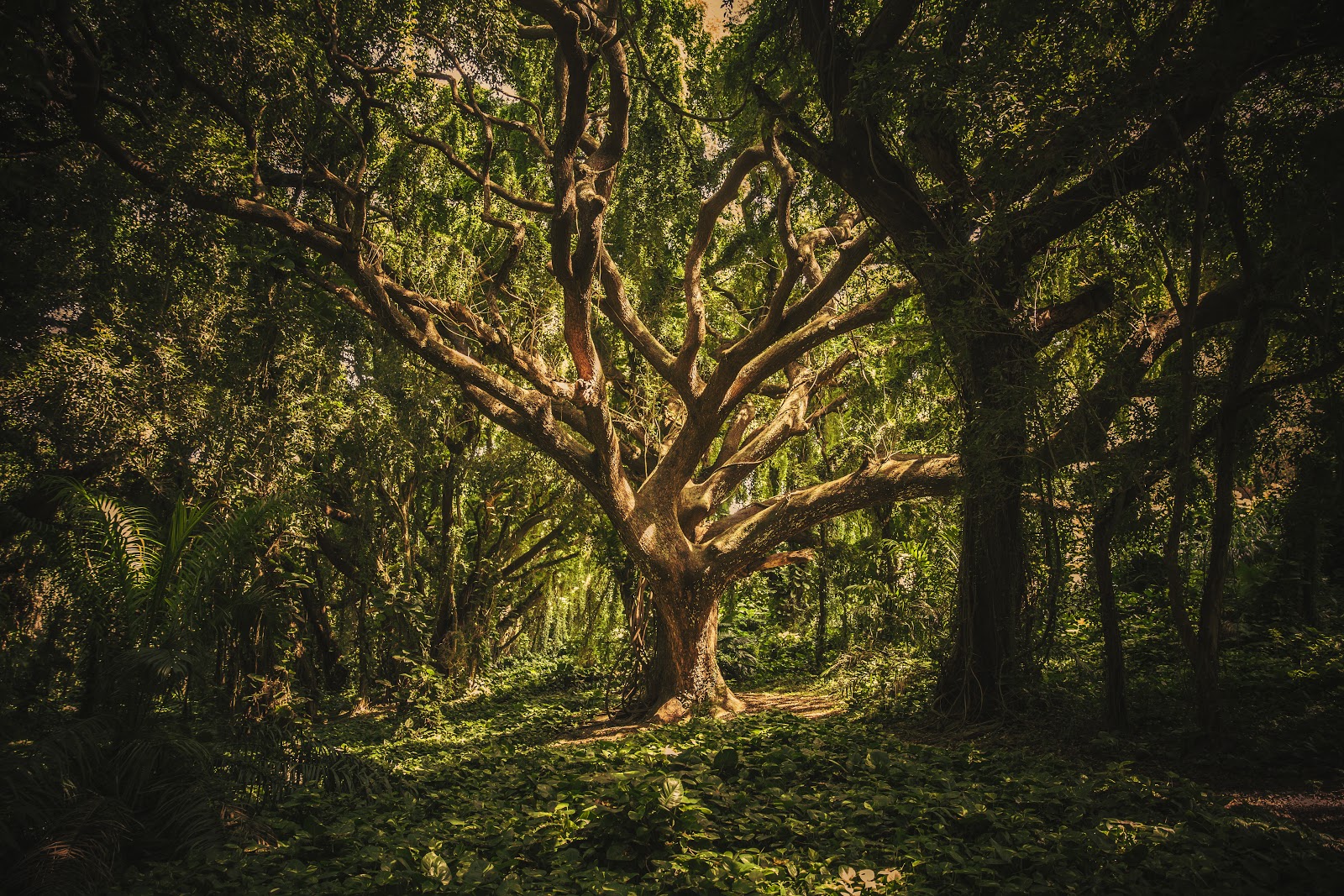
This is the image we are going to color grade:
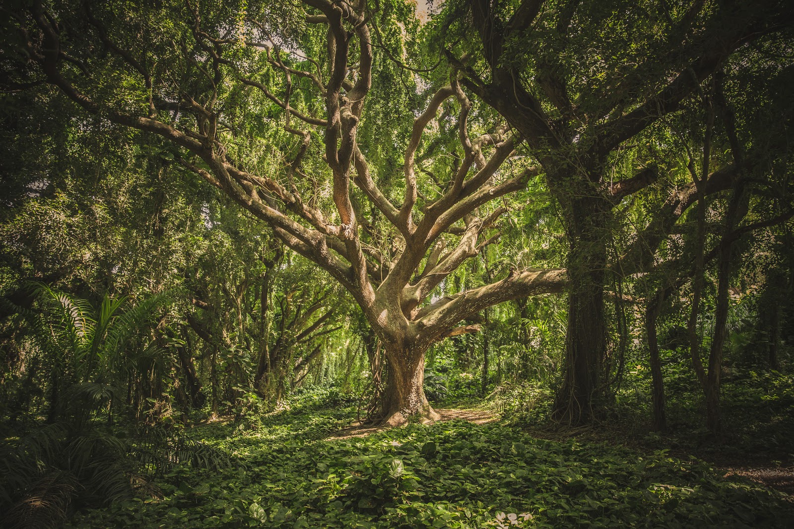
My main goal with this image is to make it warmer and earthier. I’ll do that by removing some of the harsher white light tones with warmer and more natural ones.
Applying the Gradient Map
Apply the Gradient Map in a new layer, either from Image >> Adjustments >> Gradient Map or from your Adjustments panel.
It doesn’t matter what your background and foreground colors are. We can edit those later in the process.
Now, the Gradient Bar should be visible in your adjustment panel as long as you have your Gradient Map layer selected:
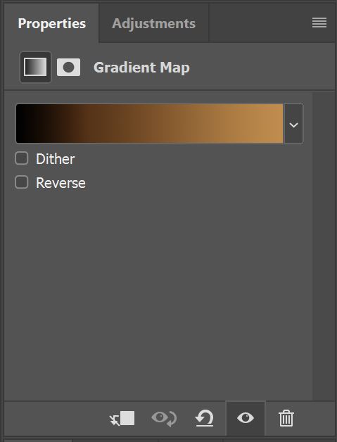
The two colors in your Gradient Bar will be the gradient between your selected foreground and background color.
Before we change these colors, let’s change the way the Adjustment Layer effects the image by editing using Blending Modes and Opacity.
When working with gradient maps, try applying the blending modes in the Overlay section:
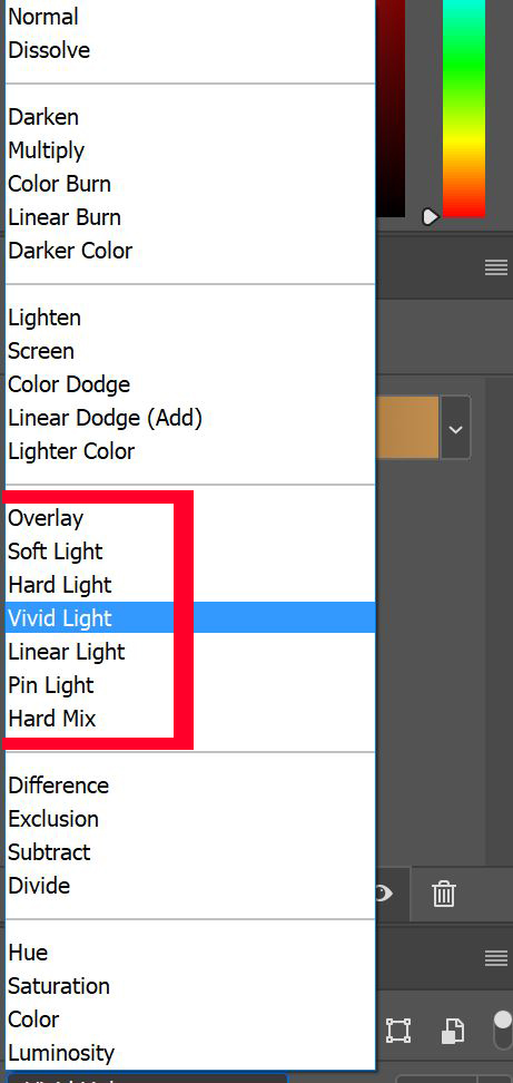
The Soft Light blending mode is the best one-click solution if you do not intent to adjust your opacity. If you want to adjust the saturation of your image, use something like Vivid Light, and then lower the opacity.
In this image, I found that using Vivid Light or Hard Light with a lower opacity worked best. Hence, I used the following settings for my adjustment layer:
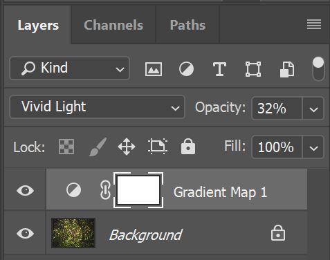
With 32% opacity and the Vivid Light Blending Mode, I can see how my current Gradient Map looks with my image.
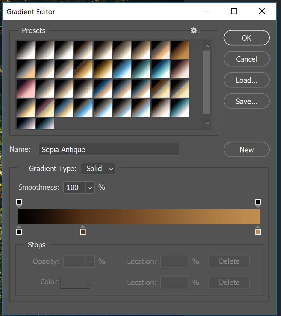
Now, I can click the Gradient Bar to see my adjustments real time as I change the parameters of the edits.
Clicking the Gradient Bar brings up the following Gradient Editor:
Now, click the settings gears to bring up a drop-down menu. You’ll now have the option to choose Photographic Toning.
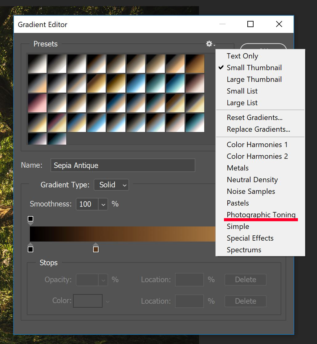
Once you navigate to the Photographic Toning drop-down menu, play around with the different presets. This menu allows you to edit the color and distance between colors. Changing the distance between the colors will make the gradient more or less fluid.
You do not need to assign colors by brightness. Create a new color by dragging one of the squares in the gradient. Then, click the color box and select your color.
Certainly, it is traditional to go from dark to light. However, you can switch it up and go light to dark, or even dark to light to dark (to light to dark to light….), it is all up to you!
Each variation you make in the Gradient Editor is also visible on the image itself, so long as the Adjustment Layer is marked as visible. Seeing your edits on your image in real time is incredibly helpful!
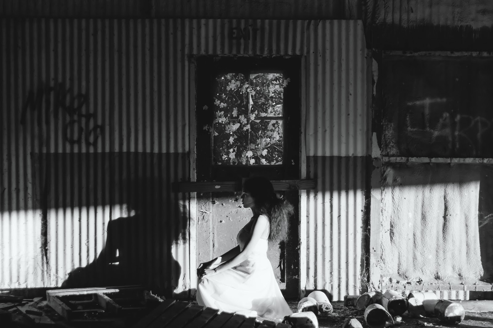
After playing around with the colors, Blending Modes, and Opacity, I settled on this final edited image:
It feels more magical and mysterious, and definitely looks like it was taken closer to twilight. This is what I wanted in the image from the onset, so I’m happy!
Best Uses for Gradient Maps in Photoshop CC
As you can see, these maps have a variety of uses. This fast adjustment layer allows much more control than tools available in camera RAW processes, such as split toning. Being able to see and control the transitional effects of the gradient is especially useful.
Furthermore, this tool allows you to apply more than two colors to an image, and can outright replace a lot of tones and annoying color problems.
Additionally, being able to adjust specific parts of your exposure, like the shadows in the face, or the rest of the skin tone, can make your images flawless.
Using the Color Picker Tool allows for even more control. For instance, you could use the color picker to choose a gradient from colors already present in your image, then use those with an overlay Blending Mode to make your image really stand out. The ability to add tonality to lighting with the color picker for consistency’s sake is amazing.
Color Grading with Gradient Maps and Portraiture
The most effective place to use color grading and gradient maps creatively may be in portraiture. If you are trying to embellish specific hues for a creative effect, you may be struggling to get the perfect effect with some of Photoshop’s other tools. The amount of manual control you have over the Gradient Tool makes this process a lot more involved, but it will ultimately deliver a better final product.
Creating Gradient Presets
When color grading portraiture, certain effects like those in the teal and orange genre are very popular. Instead of having to recreate this gradient every time, you can make a gradient preset.
Once you have created the gradient you want to save, press the New button:
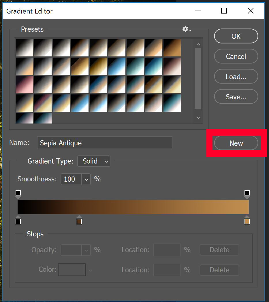
Follow the instructions in the dialog box to add your new gradient to the Presets selection. Now, you can apply it to all images from the same set.
You can also use this adjustment layer to add a more abstract colorization to an image.
On the other hand, applying several of these layers to black and white image can lend itself to a creative and abstract effect.
Keep in mind sets of colors that go well together. Complementary colors are a good starting point, as are neon green and purple or teal and orange.
I’ve had great success using technique to color grade cityscapes and architectural images, especially when the image has a high contrast and clarity that I want to dull down.
Remember that you can apply this effect in many ways, in both Blending Modes and Opacity, as well as with Layer Masks. As with most of Photoshop’s editing tools, the best way to learn is to practice.
Did you enjoy exploring this new process? If so, please follow us on Facebook and Twitter for more photography resources and photo editing tutorials. Look through our other creative tutorials to see what else you can be doing with your images.