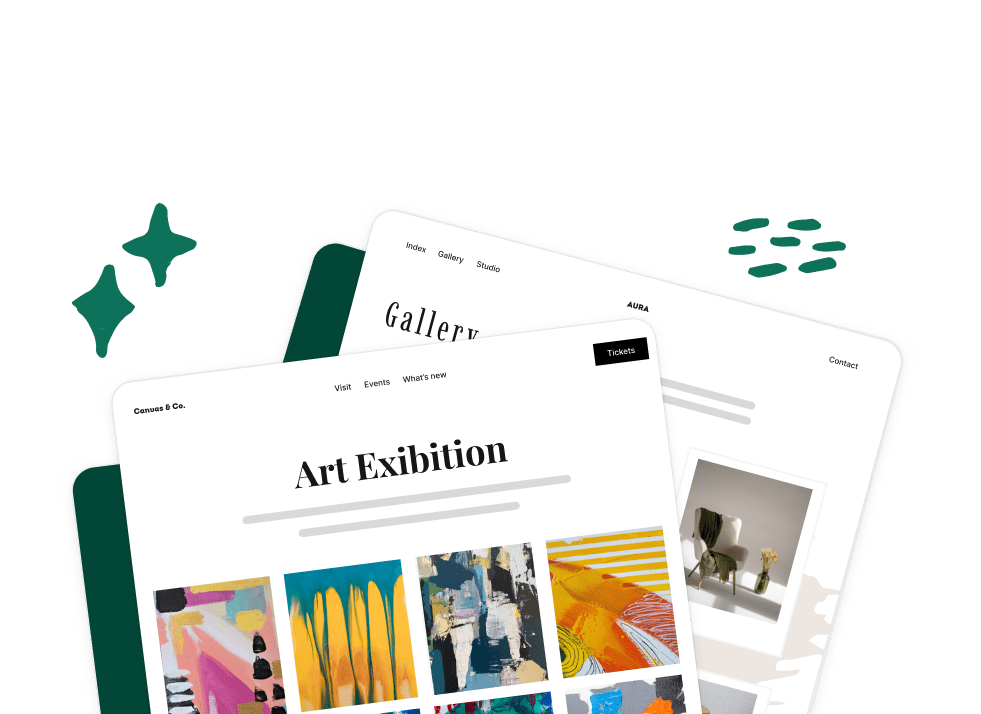
What’s better than customizable gallery options? Even more customizable gallery options! Envira Gallery now has more gallery layouts to help you create the perfect WordPress gallery for your photos or videos.
These gallery layouts guarantee that your gallery looks perfect out of the box, with the least amount of work from you. That being said, each gallery layout has its own set of custom options you can control to create the gallery of your dreams.
Of course, to take advantage of these pre-made gallery layouts, you’ll need to have downloaded and installed the Envira Gallery plugin. For more information on how to download Envira Gallery or upgrade your free license, visit our documentation.
Now, let’s take a look at Envira Gallery’s gallery layout options.
Automatic Gallery Layout
Envira Gallery applies the Automatic gallery layout as the default gallery layout when you create a new gallery. This layout fits images in your gallery together with as little space between each image as possible, while keeping the images confined to left and right borders.

This gallery layout works great for images of all shapes and sizes. That’s why it’s the default! This beautiful layout option is simple and concise, allowing your to display your images neatly on the page.
Of course, the simplicity of the Automatic layout isn’t the best choice for all galleries. If the Automatic layout feels to rigid for your design eye, try the Mason gallery layout.
Mason Gallery Layout
The Mason gallery layout takes a more free-form approach to displaying your photos and videos. This layout fits your images together like bricks, which means it also works well for photos of different sizes and orientations.

Unlike the Automatic layout, the Mason layout inserts a white border between each of your gallery images to help maintain separation. Because of the white spacing between images, the gallery feels more open and takes up more space on the page.
This gallery option features additional customization options that allow you to choose the number of columns in the layout, as well as the image size and caption displays.
Grid Gallery Layout
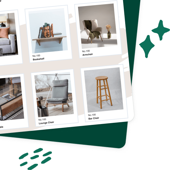
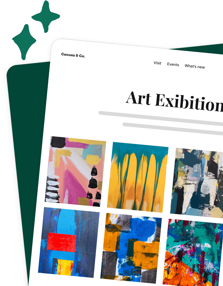
The Grid gallery layout was designed to help you create perfect displays of photos with the same size and orientation. This gallery layout keeps your photos in orderly columns and rows, which can be easily broken by photos with different dimensions.

This clean-cut, structured gallery’s minimal design means that all the attention is on your photos! Like the Mason gallery, the Grid gallery layout offers column, image and caption customization.
Square Gallery Layout
If you like the look of the Grid gallery layout but have photos of varying sizes in your gallery, the Square gallery layout is a great alternative. This layout transforms your photos into squares and then assembles them into a square grid.

If you choose the Square gallery layout, visitors to your site will still be able to view the full version of your photos by clicking on the gallery image. Make sure to adjust your column, image and caption preferences for this gallery for even more layout control.
Blogroll Gallery Layout
Photo gallery purists will love the Blogroll gallery layout, which displays your images in a scrollable blog-style format. This layout ensures that your visitors’ full attention is on one image at a time.

Like the Square gallery layout, this layout crops your images to keep tight left and right borders. Still, site visitors can view the full image by clicking on the gallery photo.
Create Your Best Gallery with Envira Gallery Layouts
Regardless of your design preferences and gallery needs, there’s an Envira Gallery layout for you! These pre-made gallery layouts looks great out of the box, but they still give you plenty of room for customization. Try them on your website to find your favorite.
Want to make the most of your Envira Gallery subscription? Check out these related guides:


