



A gallery layout dropdown gives you a list of tidy-sounding names. What it doesn’t give you is any clue which one will actually flatter your photos.
And the wrong pick shows. A neat grid filled with mismatched portrait and landscape shots reads as broken rather than curated, and your best frame ends up the same size as the throwaway.
So here’s every gallery layout in Envira Gallery, the WordPress gallery plugin, in plain English: what each one does to your photos, who it suits, and when it quietly works against you.
Where to Find Your WordPress Gallery Layout Settings
Every layout in this post lives in the same place. Open any gallery in Envira Gallery, go to the Configuration tab, and the first thing you see is a control called Gallery Layout.
It’s a thumbnail picker rather than a plain dropdown, so you get a small preview of each arrangement before you commit to it. Here’s the full set in one frame.
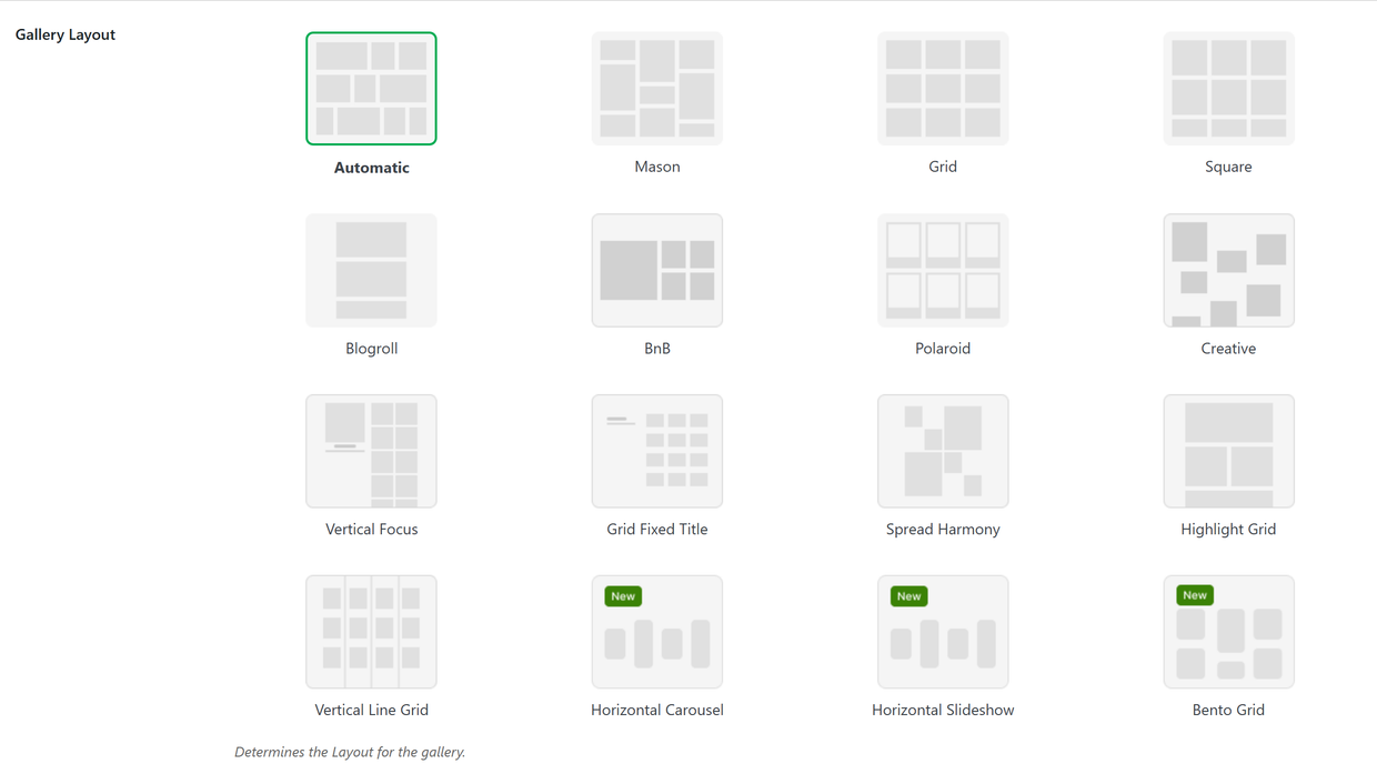
Those little previews are grey wireframes rather than photos, so they show you the shape of a layout and nothing about how your own images will sit in it.
There’s a second control worth knowing about, Number of Gallery Columns, which runs from one to six plus an Automatic setting that fills each row before starting the next. The two are tied together rather than independent: Automatic is the column setting as much as it is a layout, so the columns field stays out of sight until you pick a layout that works in columns, and most of those take their cue from whatever you choose there.
That’s the whole mechanism. Switching layouts is a click and a save, with no rebuild and no re-uploading, so nothing below is a door that closes behind you. A couple of settings do follow a gallery around when you switch, and I’ll flag those where they come up.
The WordPress Gallery Layouts Most People Are Looking For
Three layouts cover the overwhelming majority of galleries on the web, and they’re also the three that get mistaken for each other. Sorting them out takes a minute and saves a lot of trial and error.
Automatic: The Justified Image Grid Layout
If you came here hunting for a justified layout, this is it. Envira Gallery has no layout called Justified, because the justified image grid is the Automatic layout, and it’s already selected on every new gallery you create.
Automatic sizes your photos so that every full row lands at the same height and both edges of the gallery finish flush. Wide images get wider, tall images get narrower, and the gutters between them are hairline thin.
Two settings appear as soon as it’s on, and between them they shape the whole gallery. Automatic Layout: Row Height decides how tall each row is and defaults to 150px. Automatic Layout: Margins sets the space between images, defaulting to a single pixel.
The paid plugin adds a third control, Automatic Layout: Last Row, which tells that final, incomplete row whether to sit left, stretch to fill, or hide itself. Left is the default, so a gallery that does not divide evenly finishes on a short row with white space beside it. Switch it to Fill and that last row stretches out to the edges like the others. The Mobile tab carries a row height of its own too, so a gallery can be dense on a desktop and roomier on a phone.
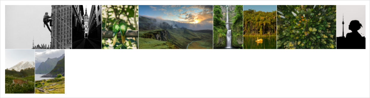
Automatic is at its best with a genuine mix of shapes that all need to be visible at once. Nothing gets cropped or stretched, and thirty photos from a single shoot read as one confident block rather than a ragged collection.
It turns on you when photos need room. Thin margins and matched rows leave each image less space to breathe, so a portfolio built on five hero shots will feel cramped. Automatic also can’t use the Gallery Themes addon, and that trade-off catches people out later.
Mason: The Masonry Gallery Layout
The option in the picker is labeled Mason, and it’s the masonry-style collage most people picture when they say Pinterest: fixed column widths, images keeping their own natural heights, and a clean white gutter between them.
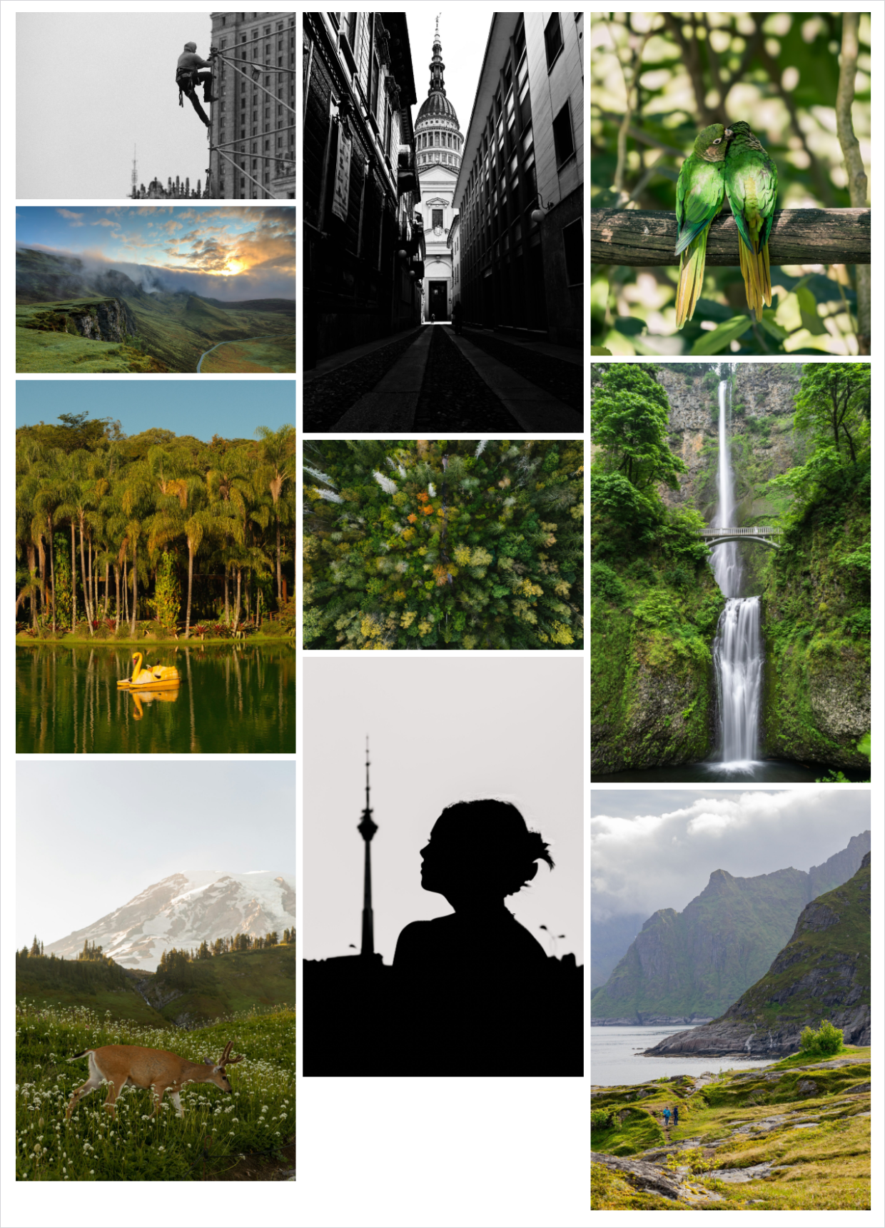
Here’s the cleanest way to hold the two apart. Automatic keeps row heights equal and lets image widths vary, while Mason keeps column widths equal and lets heights vary. Same photos, two very different pages.
Mason is the one I’d reach for with a mixed portrait and landscape set where you want every photo at the same width rather than the same height, and you still get column count, image size and caption options to fine-tune. The cost is an uneven bottom edge, because the columns rarely finish at the same point, plus a taller page overall.
Want the step-by-step setup for this one instead of the comparison? How to Create a Beautiful Masonry Image Gallery in WordPress
Grid: The Predictable Gallery Layout
Grid is the traditional arrangement: fixed columns and evenly spaced rows. It’s the most predictable layout in the picker and the easiest for a visitor to scan.
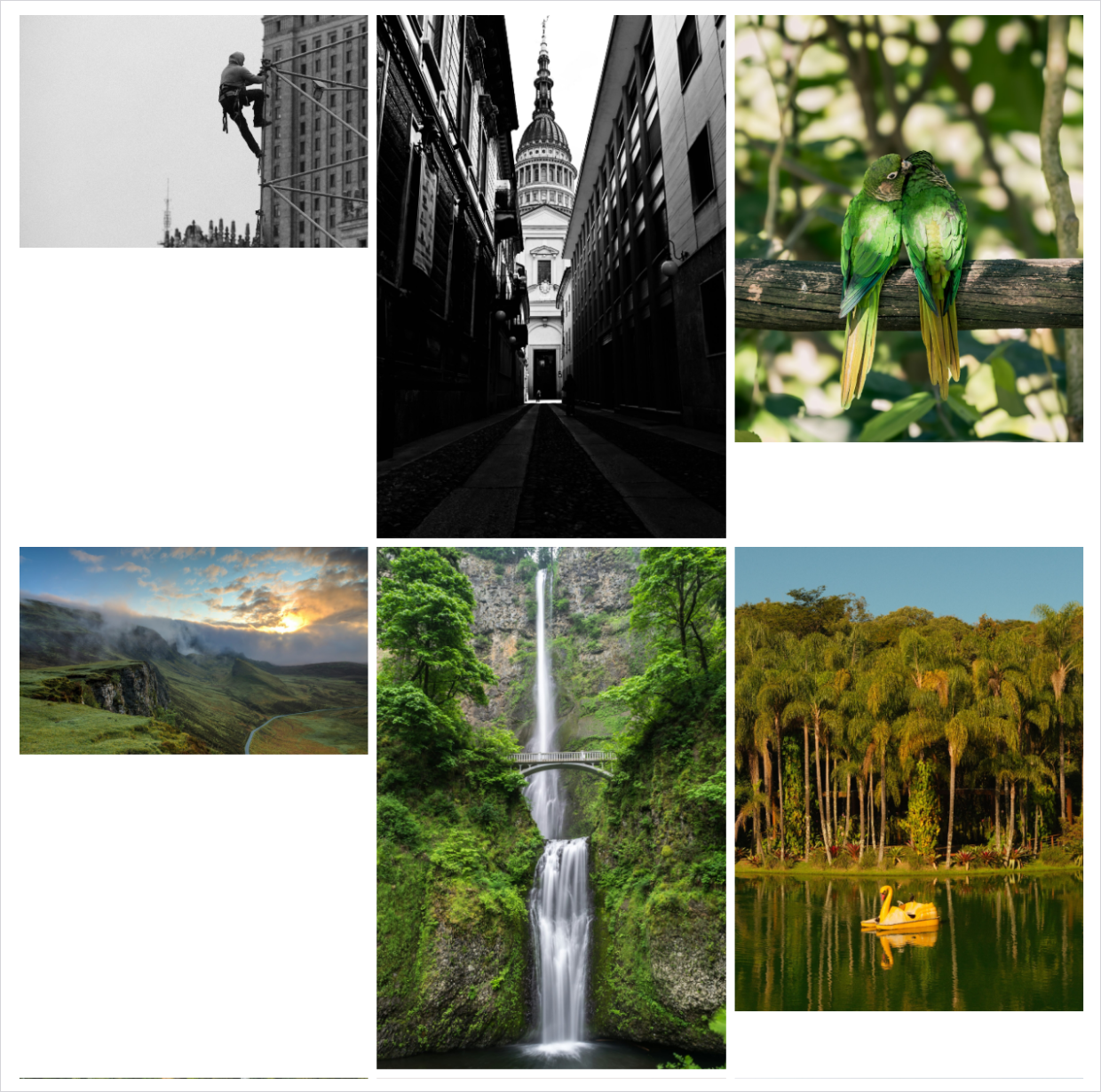
One thing to know before you pick it: Grid lines up your columns, not your photos. Each image keeps its own aspect ratio and sits at the top of its cell, and the row height is set by the tallest photo in that row. Drop a portrait shot into a row of landscapes and the landscapes end up with a stretch of white space beneath them.
So Grid shines when your images already share one size and orientation, which is why product catalogs, team headshots and print-ready exports look so good in it. Envira’s own layout announcement says as much: a grid is easily broken by photos with different dimensions.
If you want every tile genuinely identical, you have two ways to get there: tick Crop Images? in the Configuration tab so Grid trims each photo to one size, or use the Square layout below, which does it for you. Here’s the whole three-way difference in one place.
| Layout | What stays equal | What varies | Pick it when |
|---|---|---|---|
| Automatic | Row heights | Image widths | Your photos are mixed shapes and you want a dense, flush-edged gallery with nothing cropped. |
| Mason | Column widths | Image heights | Your photos are mixed shapes and you want white space around each one. |
| Grid | Column widths and row spacing | Image heights, until you turn cropping on | Your photos are already the same size and orientation and you want order above all. |
Read the middle column if you read nothing else. Deciding what you want to stay consistent is the fastest way to choose a layout, and it works for every option below too.
WordPress Gallery Layouts That Give Every Photo the Same Treatment
Two layouts take a firmer hand with your images. Square makes every tile identical by cropping, and Blogroll gives every photo the full width of the column, so neither one lets a single odd-shaped shot unsettle the arrangement. Your originals are untouched either way, and still one click into the lightbox.
Square: The Cropped Grid Layout
Square crops every photo to a square and assembles them into a grid of genuinely identical tiles. It’s Grid’s neatness without Grid’s requirement that your source images already match, and choosing it switches Crop Images? on for you at 300 by 300.
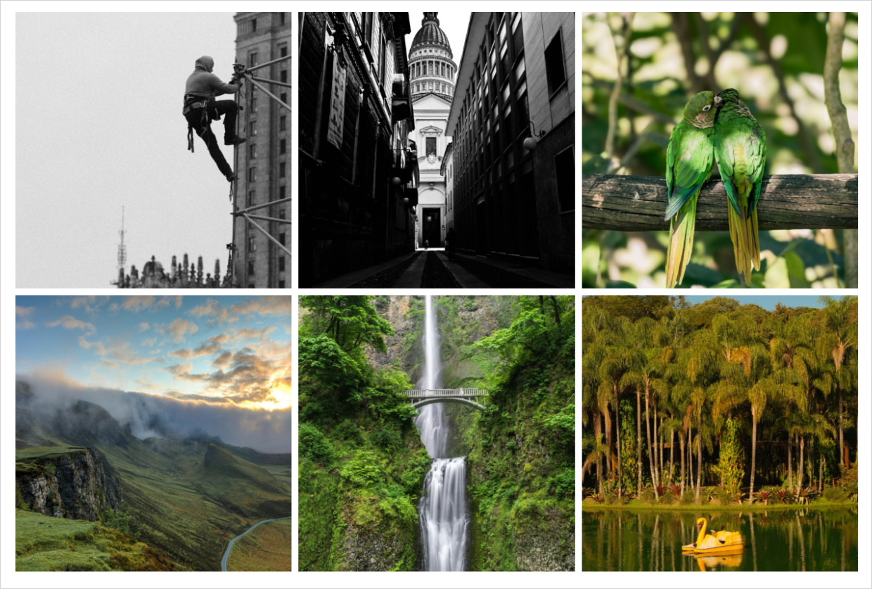
Product thumbnails and Instagram-style feeds are the natural fit, because a uniform tile makes twenty different items feel like one collection.
You pay for that tidiness in composition. A tall portrait or a wide landscape loses its framing in a square crop, so when the shape of the shot is part of the shot, Automatic or Mason treat it more kindly.
Worth knowing if you go back and forth: that cropping setting stays on when you switch to another layout. A gallery that spent five minutes as a Square gallery will keep serving square crops in Mason or Automatic until you untick Crop Images? yourself.
Blogroll: The One-Image-at-a-Time Layout
Blogroll drops your gallery into a single scrolling column, one image per row, the way photos sit inside a blog post. Nothing is cropped: each photo runs the full width of the column at its own aspect ratio.
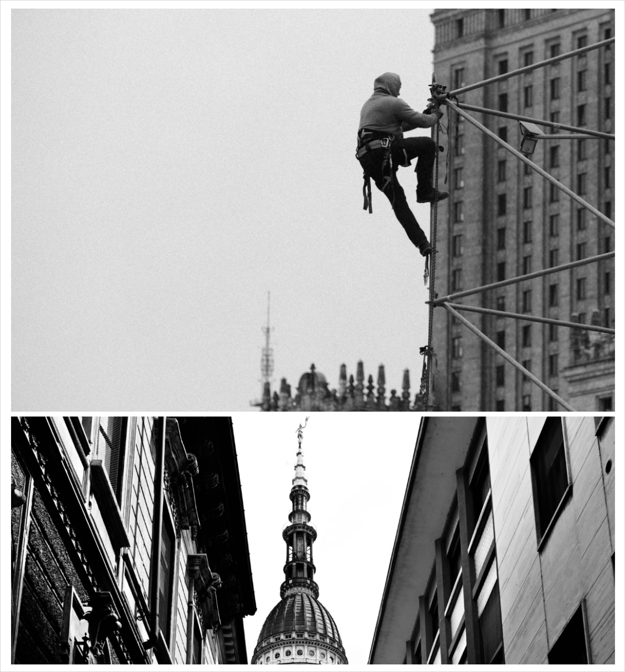
It’s the right call when you want undivided attention on each photo rather than a browsable overview. A short travel story or a build log reads beautifully this way.
Full width and no cropping does mean height, and plenty of it: ten photos alone run to several screens, and the frames worth seeing end up below a scroll nobody finishes. Pagination, available on Plus and above, takes some of that sting out.
Gallery Layouts That Put One Image in the Spotlight
Sometimes a gallery has a lead. These two layouts give one photo the frame and keep the rest a single tap away.
BnB: The Hero-and-Thumbnails Gallery Layout
BnB sets one large hero image beside a 2×2 block of four thumbnails, with a “Click for more” button that surfaces on hover and opens the rest of the gallery in an overlay. If you have ever browsed a property or room listing, you know the shape immediately.
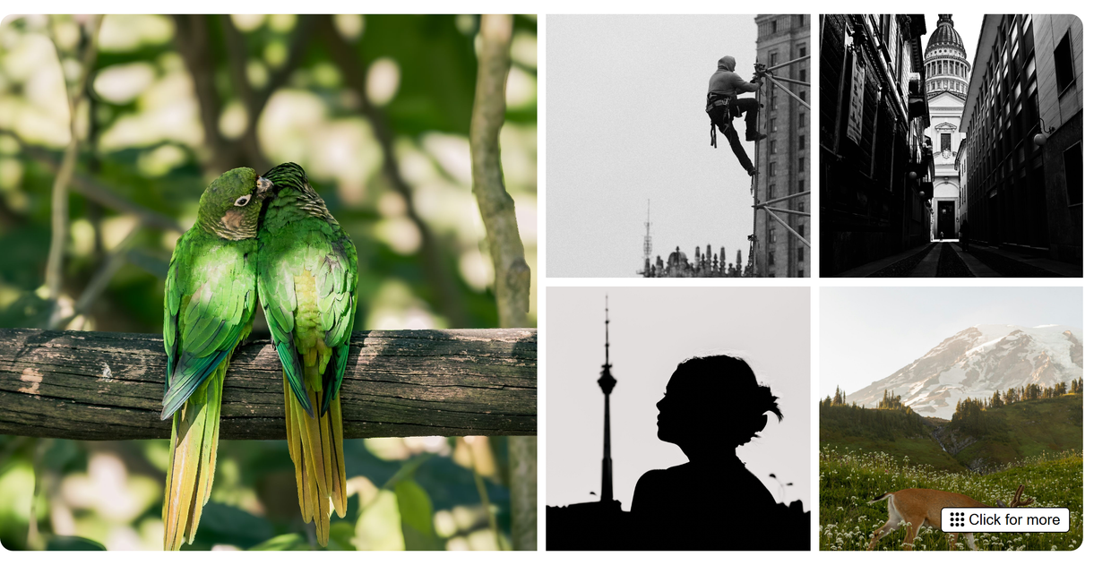
It suits any set where one shot deserves to do the selling and the rest are supporting evidence, like a rental listing or a finished renovation. With a small gallery of five or six images, though, the reveal button has almost nothing left to reveal.
Vertical Focus: The Spotlight Gallery Layout
Vertical Focus puts a spotlight image at the top left with a strip of thumbnails to its right. Click any thumbnail and the spotlight swaps instantly, and clicking the spotlight itself opens the lightbox when you have one enabled.

This is also the layout with the most deliberate mobile design. On a phone the spotlight sits uncropped across the top with a scrollable two-column thumbnail grid underneath, so the interaction survives the small screen instead of collapsing into a list.
A spotlight asks the visitor to pick one image at a time, which is why a library people came to browse in bulk is better served by Automatic or Mason.
The Whole Layout Library, Not Just the Default
The free plugin gives you the Automatic justified layout, which is a genuinely good default. Every other layout comes with a paid plan, from $39.50 for your first year.
Editorial WordPress Gallery Layouts for Storytelling
This group exists to create a hierarchy you’d otherwise have to build by hand. Instead of treating every photo equally, each one decides which images get more weight and arranges them for you.
Spread Harmony: The Magazine-Spread Gallery Layout
Spread Harmony works in a zig-zag. Each row pairs one large image with two smaller ones placed diagonally, and the pattern alternates as you scroll, with deliberate negative space and consistent gutters holding it together.
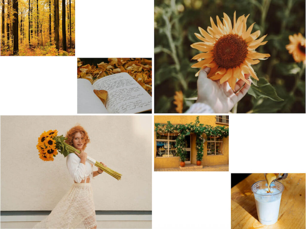
It’s made for narrative work like a travel diary or a wedding edit. The catch is that the pattern needs enough images to establish itself, so a set of four or five never gets to show the rhythm off.
Highlight Grid: The Gallery Layout That Picks Your Hero Shots
Highlight Grid alternates one- and two-column rows, and the first image, and every third one after it, becomes a full-width highlight. You get emphasis without choosing where it goes.
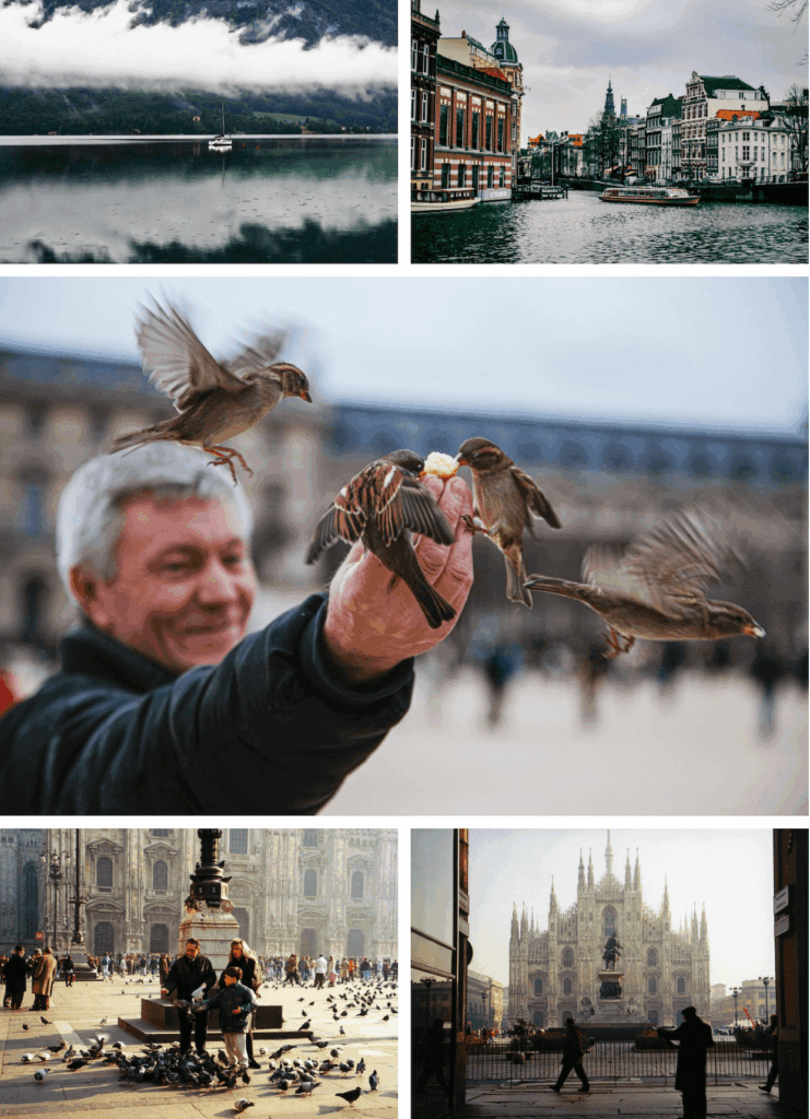
That automatic rhythm is also its one demand: the layout decides which photos get promoted, based on position rather than quality. Reorder the gallery so your strongest frames land in those highlight slots and it does lovely work.
Bento Grid: The Moodboard Gallery Layout
Bento Grid mixes tile sizes into a moodboard-style arrangement, so stronger shots stand out without you resizing anything. It’s one of the newest additions to the picker.
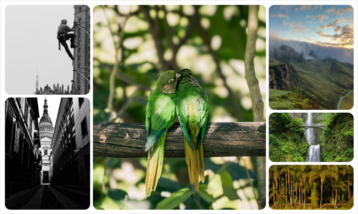
Curated sets are where it earns its keep, like a capsule collection or a small batch of your best work. Give it thirty near-identical photos and the mixed tiles stop meaning anything, because variety is the whole point of the arrangement.
Creative: The Scattered Gallery Layout
Creative is the least structured option in the picker. It scatters photos into a deliberately artistic, non-aligned arrangement instead of lining them up, placing them three to a band at staggered heights and alternating sizes so no two tops or bottoms line up.
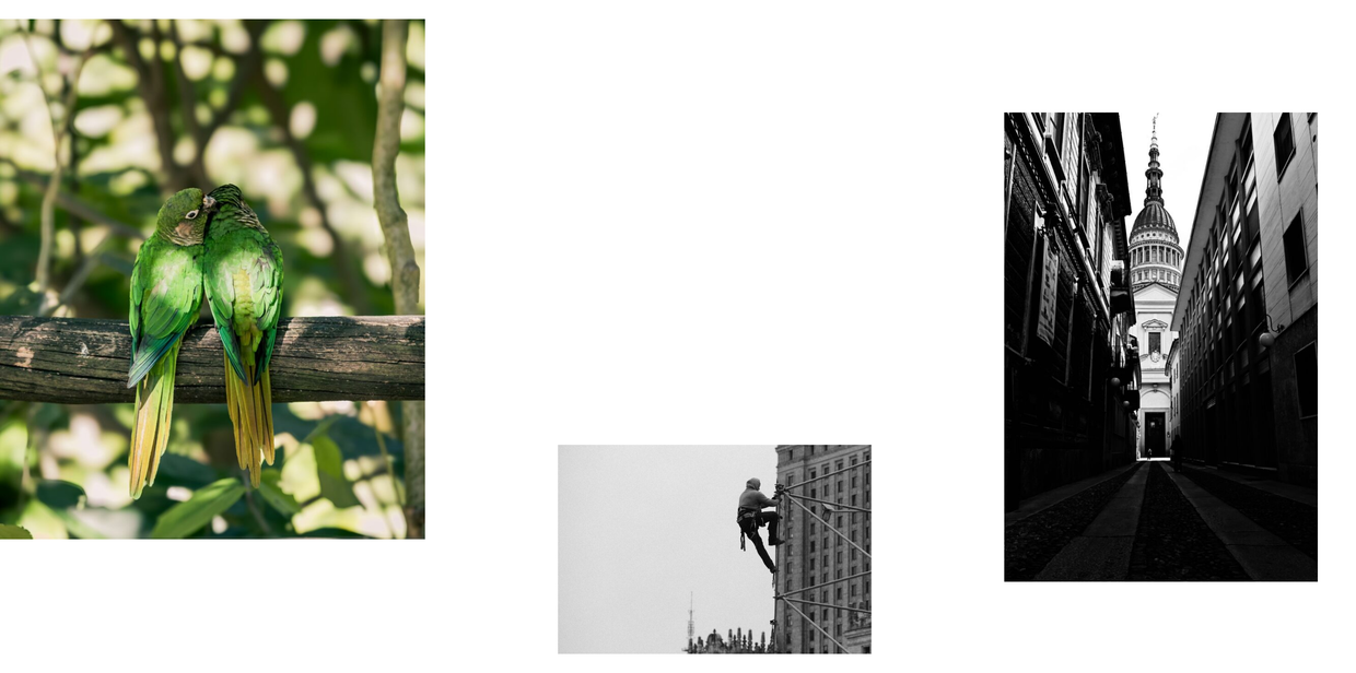
It fits expressive personal and creative portfolios where character matters more than order. That makes it the wrong choice anywhere a visitor needs to compare or find something, which is why it rarely suits a product page or a client gallery. All that air adds height too, so it rewards a small curated set rather than a full archive.
Putting an Editorial Layout to Work in a Portfolio
These arrangements do their best work inside a portfolio that is already organized. Our walkthrough covers the rest of that build, from grouping your strongest sets into galleries to getting the portfolio page live.
Gallery Layouts With Room for Captions and Context
If the words around your photos carry real information, three layouts are built to hold them. Captions stop being an afterthought squeezed under a thumbnail and become part of the design.
Polaroid: The Framed Caption Gallery Layout
Polaroid frames each photo in vintage-style borders with white space below the image that doubles as a caption area. Images can be resized, and the frame sits happily alongside columns, gallery themes, social sharing and watermarking, on the plans that include those.

Travel and craft galleries get the most out of the personality, and the white space makes it a surprisingly sleek option for eCommerce products that need a name and a price under each shot. It also works with albums, which are a Pro and above feature, not just with galleries.
The framing is a strong stylistic statement, so it can fight a minimal theme. If your site already looks clean and modern, try it on one gallery before it goes everywhere.
Vertical Line Grid: The Portrait-Friendly Gallery Layout
Vertical Line Grid runs clean vertical columns and shows images at their full dimensions, with titles and captions displayed below each one. You can crop and resize instead if you prefer, but the default respects the frame you shot.

This is the pick for portrait-oriented work and for galleries where the caption is part of the content, like species names or client credits. Landscape-heavy sets get less out of it, since the vertical columns are built to flatter tall images.
Grid Fixed Title: The Gallery Layout With a Text Panel
Grid Fixed Title takes a standard grid and adds a title and description panel on the left that stays put while the photos scroll past it. The text comes straight from your gallery’s own description box in the builder.

It solves a specific and annoying problem: project context or a short bio that had nowhere to go except a caption. For agencies it removes the need to build a custom template for a case-study page. The panel does take horizontal room from the images, though, so a wide landscape set has less space to play with.
Horizontal WordPress Gallery Layouts
The last two layouts change the direction of travel. Instead of scrolling down through your photos, visitors move sideways through a single band that sits inside your page.
Horizontal Carousel: The On-Page Scrolling Gallery Layout
Horizontal Carousel turns the gallery into one row that visitors drag sideways. It’s the layout to reach for when a gallery shouldn’t eat the whole page.
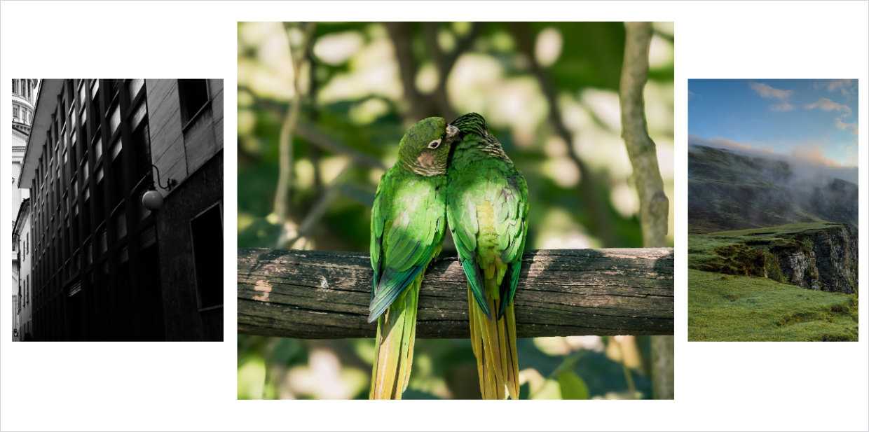
Product rows and portfolio strips on a homepage both suit it. Order the gallery deliberately, though, because out of the box there are no arrows and no dots to nudge anyone along: whatever sits off the right edge only exists for visitors who think to drag, so the best frames belong at the front. Here’s how to change the order of images when you need to. There’s more on getting that right in our roundup of the best WordPress carousel plugins.
Horizontal Slideshow: The Sequential Gallery Layout
Horizontal Slideshow keeps the same horizontal format but plays photos one at a time, each getting the full frame, with a thumbnail strip for navigation.
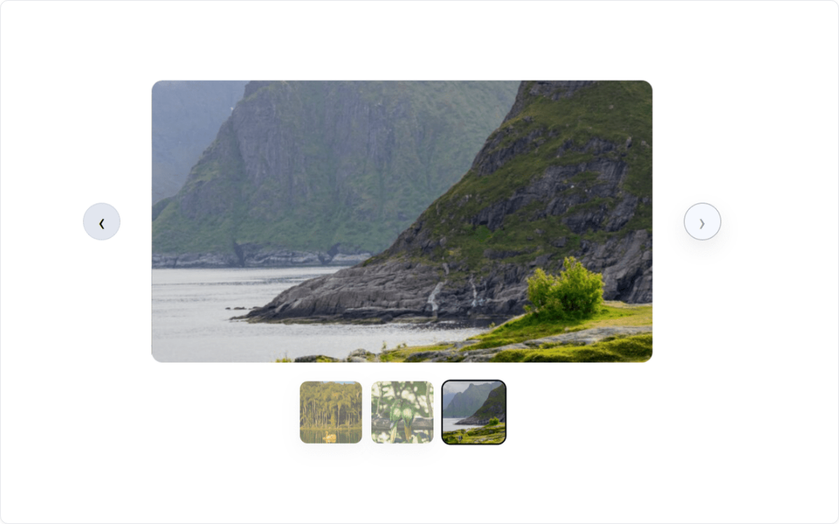
Sequence is the reason to choose it. A wedding told in order, or a set of portfolio highlights with a deliberate first and last frame, lands better here than in any grid. Ask it to present a hundred images and the one-at-a-time pacing becomes a chore.
A naming point before you go looking. The Horizontal Slideshow layout and the Slideshows addon are different things: the layout plays on your page, while the addon, available on Basic and above, autoplays inside the lightbox with its own speed and transition controls. Pagination, on Plus and above, and Proofing, on Pro and above, were both updated to work alongside these two layouts, which is covered in the announcement for the newest Envira layouts.
In the picker at the top of this post, those three sit together at the end rather than beside the layouts they resemble, because they are the most recent arrivals.
WordPress Gallery Layouts Are Not Gallery Themes
These two get muddled constantly, and the difference matters because one of them can’t be used with the default layout.
A layout decides where your photos sit and what shape they take. The Gallery Themes addon, available on Plus and above, is a separate dropdown of preset design styles applied on top of a column-based layout, and it restyles your gallery and lightbox images rather than rearranging them.
Here’s the trade-off in one line. Automatic galleries have no themes to select, so the justified look means giving up gallery themes, and themes mean moving to one of the column-based layouts.
Setting up the justified look for the first time? The full walkthrough is in the docs: Justified Image Grid Gallery
For most people that’s an easy call. If your gallery is the page, the density of Automatic usually wins. If the gallery sits inside a designed page, a themed column layout blends in better.
Our guide to customizable gallery themes walks through what the presets actually change.
Which WordPress Gallery Layout Should You Use?
If you’d rather not read back through all of that, here’s the short version by the kind of site you’re building.
- Photography portfolios: Automatic for a dense professional default, Vertical Line Grid for portrait-heavy work, Grid Fixed Title when a bio or project write-up belongs beside the photos.
- Bloggers: Blogroll for one image at a time inside a post, Spread Harmony for travel and lifestyle stories, Horizontal Carousel when the gallery is a detail rather than the main event.
- Online stores: Square for consistent thumbnails from inconsistent product photos, Grid when your shots already match, Polaroid when each item needs a caption.
- Wedding and event photographers: Horizontal Slideshow for sequence, Spread Harmony for a magazine-style edit of a shoot.
- Large image libraries: Automatic or Grid, where predictability beats personality, paired with pagination on Plus and above.
And if you genuinely don’t want to make this decision at all, leave it on Automatic. It’s the default for a reason: it handles mixed image sizes without cropping and needs nothing from you.
 Expert Tip
A picker thumbnail tells you almost nothing about how your own photos will land. What I would do instead is give the gallery its own URL with Standalone Galleries, available on Basic and above, then open that page and switch layouts with the real images in front of you. Three minutes of that beats an hour of guessing.
Check these three things on every layout you try
- Your widest and tallest photo, since those are the two that break a layout first.
- The last row, which is where an unfinished gallery looks unfinished.
- The same page on your phone, because column counts behave differently on a narrow screen.
FAQs About WordPress Gallery Layouts
What is the best gallery layout for WordPress?
There isn’t one, and any answer that ignores your photos is guessing. A justified layout like Envira Gallery’s Automatic is the safest default because it handles mixed image sizes without cropping anything. If your images already share a size and orientation, a plain grid looks cleaner.
What is a justified gallery layout?
A justified gallery sizes your photos so every full row lands at the same height and both edges of the gallery finish flush, the way justified text does. In Envira Gallery it’s called the Automatic layout, and it’s already selected on every new gallery you create.
What is the difference between a masonry and a grid gallery layout?
A grid keeps your columns and row spacing uniform, but each image keeps its own proportions unless you turn cropping on, so mixed dimensions leave gaps in the cells. Masonry keeps the column widths equal and lets each image keep its own height, packing them tight, which is why the bottom edge comes out uneven. Envira Gallery’s masonry option is labeled Mason in the layout picker.
Can I change a WordPress gallery layout after publishing it?
Yes. The layout is a per-gallery setting in the Configuration tab, so switching is a click and a save, and nothing gets rebuilt or re-uploaded. Two things to watch: cropping stays switched on once something has switched it on, and gallery themes aren’t available on the Automatic layout.
How many columns should a WordPress gallery have?
Three or four suits most content pages, and the Number of Gallery Columns control goes from one to six. There’s also an Automatic setting that fills each row before starting the next, which is the one to use when you’d rather not count.
Do WordPress gallery layouts work on mobile?
They adapt to smaller screens, and a couple give you direct control. The Automatic layout has its own row height setting on the Mobile tab, and Vertical Focus switches to an uncropped spotlight with a scrollable two-column thumbnail grid below it. I still check any layout on a real phone before publishing.
Are WordPress gallery layouts free in Envira Gallery?
The free plugin gives you one: the Automatic justified layout, which handles mixed image sizes without cropping anything and is enough to build a good-looking gallery. The other 15 come with a paid plan, and the pricing page lists what each plan includes.
Pick the layout that matches the photos you already have, look at it on the real page, and change it whenever your work changes. For more control over how those rows and columns behave, be sure to check out our post on how to display WordPress photos in columns and rows.
Not using Envira Gallery yet? Get started today!
Don’t forget to follow us on Facebook and X (Twitter) for the best photography tips, resources, and WordPress tutorials.