


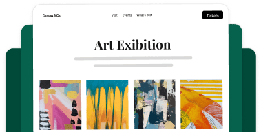


The majority of web traffic now comes from mobile devices, yet many image galleries are still designed with desktop users in mind. If you’re a photographer, creative professional, or business owner showcasing visual content, this creates a serious problem.
Galleries that look stunning on desktop often provide frustrating experiences on mobile—images load slowly, navigation feels clunky, and visitors leave before seeing your best work. With Google’s mobile-first indexing, poor mobile performance doesn’t just hurt user experience, it also directly impacts your search rankings.
Fortunately, optimizing your WordPress image galleries for mobile doesn’t require technical expertise or hours of configuration. With the right settings, you can create galleries that look beautiful and perform flawlessly on every device.
In this guide, I’ll show you how to optimize your image galleries for mobile. You’ll learn exactly which settings to configure, why they matter, and how to create a mobile experience that keeps visitors engaged. Let’s dive in!
Why Mobile Optimization Matters for Image Galleries
Before we jump into the technical steps, let’s talk about why mobile optimization deserves your attention. Mobile users face unique challenges that desktop visitors don’t experience.
They’re browsing on smaller screens where every pixel counts, navigating with touch gestures instead of precise mouse clicks, and often dealing with slower connection speeds when they’re on the go. A gallery that loads quickly on your office desktop might crawl to a halt on a smartphone using 4G.
These challenges have real consequences. Studies show that 53% of mobile visitors will abandon a site if it takes longer than 3 seconds to load. That statistic represents real missed opportunities, like:
- Potential clients leaving before they ever see your portfolio
- Wedding couples bouncing from your site before viewing your best work
- Blog visitors scrolling past your gallery because it won’t load
- Lost inquiries and conversions that you’ll never even know about
Google understands this, which is why they switched to mobile-first indexing.
Search engines now primarily use the mobile version of your site for ranking and indexing. If your galleries aren’t optimized for mobile, you’re not just frustrating visitors—you’re actively hurting your ability to be found in search results.
When you optimize your galleries for mobile, you create better experiences that translate directly to business results: higher engagement rates, more inquiries from potential clients, increased time on site, and better search rankings.
Want to grow your photography business using search engine optimization?
Check out our complete guide to SEO for photographers. We go over all the essential tips, tools, and tricks for beginners.
How to Optimize Image Galleries for Mobile (The Easy Way)
Now that you understand why mobile optimization matters, let’s walk through the process of creating mobile-optimized galleries in WordPress.
By default, WordPress doesn’t include mobile-specific settings for image galleries. While the basic WordPress gallery block creates responsive layouts, you can’t control how images display on mobile devices, adjust dimensions for smaller screens, or customize the mobile viewing experience.
You’ll need a dedicated gallery plugin to access these essential mobile optimization features. While there are several gallery plugins available, Envira Gallery stands out as the best option for mobile optimization.

Here’s why:
- Dedicated mobile settings: Envira includes a complete Mobile tab with settings specifically designed for smartphones and tablets. You can create separate mobile versions of your galleries with optimized dimensions, custom lightbox behavior, and touch-friendly navigation.
- Automatic responsive design: Your galleries automatically adapt to any screen size, but Envira goes further by letting you fine-tune exactly how they appear on mobile devices.
- Built-in performance optimization: Envira includes lazy loading, image compression, and efficient code that ensures your galleries load quickly even on slower mobile connections.
- Touch-optimized navigation: Mobile users get intuitive swipe gestures, larger touch targets, and navigation designed specifically for thumbs, not mouse cursors.
- No coding required: All mobile optimization happens through simple checkboxes and dropdown menus. If you can click a mouse, you can create mobile-optimized galleries.
Best of all, Envira Gallery combines mobile optimization with comprehensive gallery features like albums, watermarking, social sharing, client proofing, and eCommerce integration—all in one plugin.

Panoptic Design
Responsive, prompt, and clear support is critical for every site plugin. Envira Gallery has exceeded my expectations every time. It is a flexible, mobile-responsive gallery plugin with terrific support.
Ready to create your first mobile-optimized gallery? Let’s get started.
Step 1: Install and Set Up Envira Gallery
First, you’ll need to install Envira Gallery on your WordPress site. Head over to the Envira Gallery pricing page and choose the license level that works for you. The mobile optimization features we’ll be using are available with all paid plans.
After purchasing, download the plugin files from your Envira Gallery account. Then, go to your WordPress dashboard and navigate to Plugins » Add Plugin.
Click the Upload Plugin button at the top of the page. Select the Envira Gallery .zip file you downloaded and click Install Now.

Once the installation completes, click Activate Plugin. You’ll now see a new Envira Gallery menu appear in the left-hand sidebar of your WordPress dashboard.
Next, you’ll need to enter your license key, which you can find in your Envira account. Go to Envira Gallery » Settings and paste in your key. Click Verify Key and then Save Settings.

If you need more detailed guidance on installation, check out our step-by-step tutorial on how to install Envira Gallery.
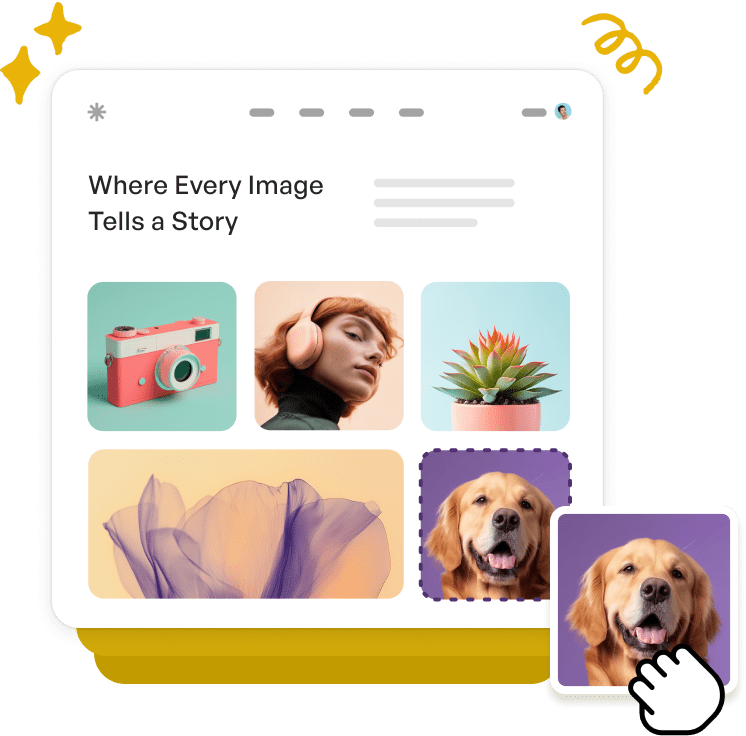
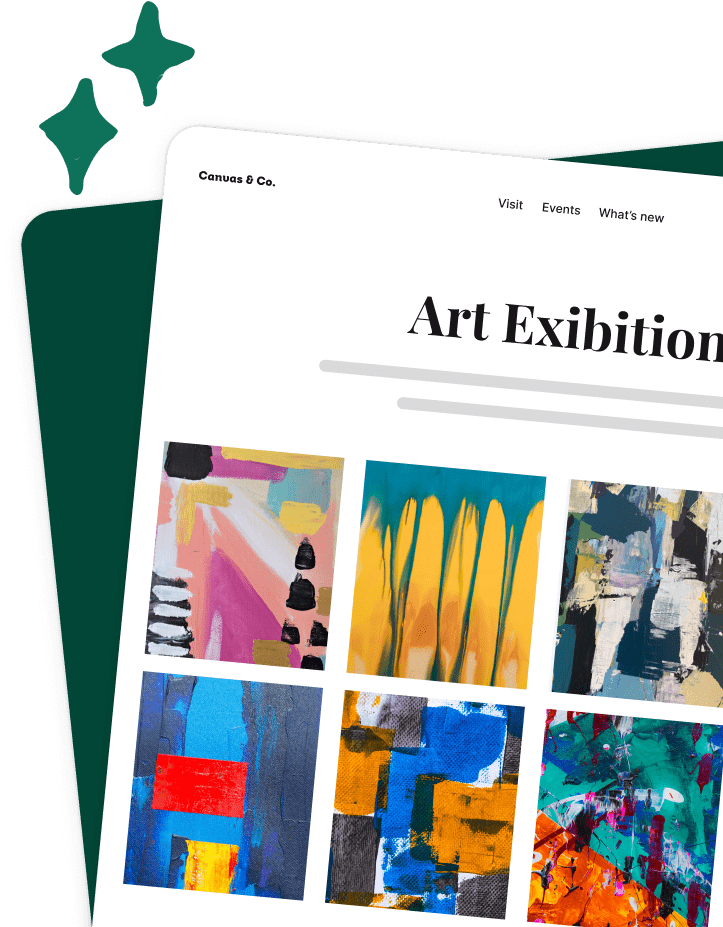
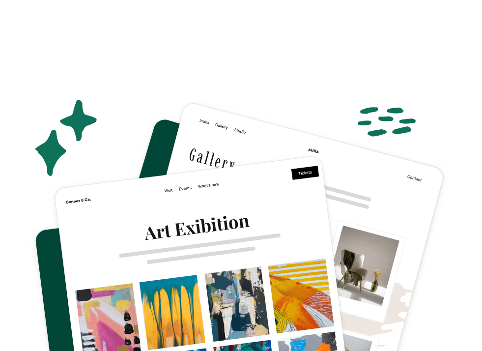
Step 2: Create Your Image Gallery
With Envira Gallery installed and activated, it’s time to create your gallery. Navigate to Envira Gallery » Add New in your WordPress dashboard.
Give your gallery a title and drag and drop your images into the upload area. You can also select images from your WordPress Media Library if you’ve already uploaded them.

Once you’ve added your images, you can rearrange them by dragging and dropping, and click the pencil icon on any image to add titles, captions, or alt text.
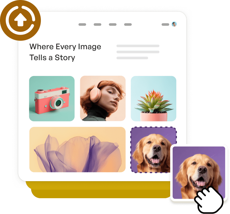
Next, click on the Configuration tab to select your gallery layout—options like automatic, masonry, or grid. Each works differently on smaller screens.

Need more detailed instructions? Check out our complete tutorial on how to create a photo gallery in WordPress.
Now that your gallery is created, let’s optimize it specifically for mobile devices.
Step 3: Enable Mobile Gallery Settings and Set Dimensions
Now for the best part. Envira Gallery’s Mobile tab gives you complete control over how your galleries appear and function on smartphones and tablets.
Scroll down to the gallery settings and click on the Mobile tab.
The first setting you’ll see is Create Mobile Gallery Images? Check this box to enable mobile-specific optimization.
When you enable this option, Envira automatically creates separate, optimized versions of your images specifically for mobile devices.

This means mobile visitors get appropriately sized images that load faster, while desktop users still see your full-quality photos.
Next, you’ll see the Mobile Dimensions settings. These fields control the width and height of images displayed on mobile devices.
The default dimensions (320 x 240 pixels) work well for most mobile galleries, but you can adjust these based on your needs:
- For portrait photography: Consider taller dimensions like 320 x 400 to showcase vertical images
- For landscape photography: Wider dimensions like 400 x 300 work better for horizontal compositions
- For product galleries: Square dimensions like 300 x 300 create consistent, grid-friendly displays
Remember, these dimensions determine how images appear in the gallery grid itself, not in the lightbox view (we’ll configure that in the next steps).
Step 4: Configure Mobile Title and Caption Display
Next, scroll down to the Enable Title/Caption Below Image? option. This dropdown lets you choose whether to display titles, captions, both, or neither beneath images on mobile devices.

For mobile galleries, I recommend these approaches:
- None: Best for clean, minimal portfolios where images speak for themselves.
- Caption only: Great for adding context without cluttering small screens.
- Title and Caption: Useful for educational galleries or when you need to provide detailed information.
Keep in mind that titles and captions take up valuable screen space on mobile, so only enable them if they add genuine value for your mobile visitors.
Step 5: Optimize Mobile Lightbox Settings
The lightbox is where mobile users view your images in full-screen mode, so optimizing this experience is crucial. Scroll down in the Mobile tab to find the Mobile Lightbox Settings section.
Enable Lightbox? should be enabled by default, but if it isn’t, make sure to check the box. This allows visitors to tap on gallery images to view them in a full-screen lightbox overlay.

Enabling the lightbox is especially important for mobile users. It gives them a distraction-free way to focus on individual images without other page elements competing for attention on their small screens.
Enable Touch-Friendly Navigation
Once lightbox is enabled, you’ll see several options for customizing the mobile viewing experience.
- Close Lightbox on Swipe Up: This option lets mobile users close the lightbox by swiping up, similar to how Instagram and Facebook stories work. It’s an intuitive gesture that most mobile users already understand.
- Enable Gallery Arrows: Check this box to display navigation arrows in the lightbox. On mobile devices, these arrows are sized for easy tapping with thumbs, making it simple to browse through your gallery without closing the lightbox.
I recommend enabling both of these options. They give mobile users multiple ways to navigate—swipe gestures for quick browsing and arrows for precise control.
Configure Mobile Thumbnails
Further down, you’ll see options for gallery thumbnails in the lightbox view.
Check Enable Gallery Thumbnails to display a thumbnail strip that shows all images in your gallery. This gives mobile users a visual overview and lets them jump directly to specific images.
You can customize the Gallery Thumbnails Width and Gallery Thumbnails Height to control how these thumbnails appear. For mobile devices, I suggest keeping thumbnails small:
- Width: 75 pixels
- Height: 50 pixels
These dimensions ensure thumbnails are visible and tappable without overwhelming the screen or obscuring the main image.
When to skip thumbnails on mobile: If you have galleries with 30+ images, consider disabling thumbnails on mobile. The thumbnail strip can become unwieldy on small screens with very large galleries.
Step 6: Publish & Test Your Mobile-Optimized Gallery
Once you’re satisfied with your gallery settings choices, it’s time to add it to your website.
Navigate to the page or post where you want to display your gallery. In the WordPress content editor, click the + button to add a new block.
Search for “Envira Gallery” and select the Envira Gallery block. Once you’ve added the block to the page, a dropdown menu will appear showing all your galleries. Select the mobile-optimized gallery you just created.

Your gallery will immediately appear in the editor preview. At this point, I recommend using the WordPress editor’s device preview feature to see how your gallery will look.

However, keep in mind that this is just a preview and you won’t be able to engage with the gallery itself.
If something doesn’t look right, return to the Mobile tab and adjust your settings. Sometimes small tweaks to dimensions or thumbnail sizes can make a big difference in the mobile experience.
When you’re happy with how your mobile gallery looks, click Publish or Update to make it live on your site.
I also recommend doing one final test to ensure everything in your gallery looks good and works correctly. The easiest way to test your live gallery is using your smartphone or tablet.
When testing, pay attention to:
- Loading speed: Do images load quickly, or do visitors wait several seconds?
- Touch responsiveness: Are buttons and arrows easy to tap? Does swiping feel natural?
- Visual appeal: Do images look sharp and properly sized for the screen?
- Navigation: Can you easily move between images in the lightbox?
If you don’t have a mobile device handy, you can use your browser’s developer tools to simulate mobile viewing.
To do this, simply right-click anywhere on your page and select Inspect (or press F12)
Then, click the device toggle icon (usually looks like a phone and tablet) and select a mobile device from the dropdown menu.

And that’s it!
I hope this article helped you learn how to optimize images for mobile in WordPress.
Here are a few more resources you might want to check out:
- How to Optimize Images for Web: Ultimate WordPress Guide
- How to Create a Slideshow in WordPress (The Easy Way)
- How To Create a Stunning Photo Album In WordPress (Step-by-Step)
Not using Envira Gallery? Get started today!
Don’t forget to follow us on Facebook and X (Twitter) for the best photography tips, resources, and WordPress tutorials.
Frequently Asked Questions About Mobile Gallery Optimization
What’s the difference between responsive and mobile-optimized galleries?
Responsive galleries automatically adjust their layout to fit different screen sizes, but they still serve the same images and settings to all devices. Mobile-optimized galleries go further by creating device-specific versions with appropriately sized images, touch-optimized controls, and settings tailored for mobile viewing. Think of responsive as “fits the screen” and mobile-optimized as “designed for the screen.”
How do I know if my gallery is properly optimized for mobile?
The best way is to test it on actual mobile devices. Load your gallery on a smartphone and check: Does it load in under 3 seconds? Can you easily tap navigation elements? Do images look sharp without pixelation? Does the lightbox respond smoothly to swipe gestures? You can also use Google’s Mobile-Friendly Test tool to verify your gallery meets mobile usability standards.
Will mobile optimization slow down my desktop gallery?
No. When you enable mobile gallery images in Envira, it creates separate image versions specifically for mobile devices. Desktop users continue to see the original, full-quality images you uploaded. The mobile settings only activate when visitors access your site from smartphones or tablets, so desktop performance remains unchanged.
Can I have different settings for mobile versus desktop?
Absolutely. That’s exactly what Envira Gallery’s Mobile tab enables. You can set different image dimensions, enable or disable thumbnails, customize lightbox behavior, and adjust navigation options specifically for mobile devices while keeping different settings for desktop. This gives you complete control over the experience for each type of visitor.
What mobile dimensions should I use for my gallery?
It depends on your content and audience. The default 320 x 240 pixels works well for most galleries, but you can adjust based on your needs. Portrait photographers might use taller dimensions (320 x 400), landscape photographers might prefer wider settings (400 x 300), and product galleries often work best with square dimensions (300 x 300). Test different dimensions on your target devices to find what looks best.
Should I disable thumbnails on mobile galleries?
It depends on your gallery size. For smaller galleries (under 20 images), thumbnails help mobile users navigate and jump to specific images. For larger galleries (30+ images), the thumbnail strip can become cluttered on small screens. Consider using pagination instead for very large galleries, or disable thumbnails entirely if you want a cleaner mobile experience.
Does Envira Gallery automatically make galleries mobile-responsive?
Yes, all Envira Gallery layouts are automatically responsive, meaning they adapt to different screen sizes. However, “responsive” and “mobile-optimized” aren’t quite the same thing. Responsive galleries resize to fit the screen, but mobile optimization goes further—it creates specially sized images for mobile devices, enables touch-friendly navigation, and lets you customize settings specifically for smaller screens. That’s why using the Mobile tab settings gives you better results than relying on responsive design alone.


