


Understanding WordPress image sizes and selecting the proper dimensions is crucial for creating a polished, professional website.
I’ve seen way too many beginners (including myself once upon a time) ignore image sizes. It looks good when you upload it, so it must be okay, right? Wrong. Incorrect or unoptimized image sizes can cause a host of problems, from painfully slow loading times to glitchy designs that look horrible on mobile.
After years of working as a WordPress SEO specialist, I’ve learned how important image sizes are for search rankings and user experience. Luckily, it’s pretty easy to get it right once you understand how WordPress media sizes work.
In this article, we’ll walk you through the different image size options, how to adjust them, and the best practices for using images effectively on your WordPress site.
Guide to WordPress Image Sizes
What Are the Default WordPress Image Sizes?
When you upload an image to WordPress, it automatically generates several versions of the image at different sizes. These preset image sizes are designed to help you manage how your images are displayed across your site.
WordPress creates the following default image sizes for each image you upload:
- Thumbnail: 150×150 pixels, used for small previews, such as in galleries or featured images.
- Medium: 300×300 pixels (max width/height), often used for blog post images.
- Large: 1024×1024 pixels (max width/height), typically for hero images and larger displays.
- Full Size: The original size of the image. It’s perfect for maintaining high quality but can slow down your site if not optimized properly.
These sizes are designed to cover the most common use cases, but you can also adjust the default sizes to fit your specific WordPress theme and site design.
How to Change Your WordPress Media Sizes
Although WordPress generates default image sizes, they may not always work with your website’s design. For instance, if your theme displays featured images in a rectangular layout, the default square thumbnail size (150×150 pixels) might awkwardly crop parts of your image. Similarly, default sizing for blog post images could look dwarfed and inconsistent if your layout has a wide format.
Fortunately, it’s easy to customize these settings directly within your WordPress dashboard. Here’s how to adjust the default sizes to better fit your site:
- Go to Media Settings: From your WordPress dashboard, go to Settings » Media. Here, you’ll see fields for the thumbnail, medium, and large sizes.
- Enter the Max Desired Dimensions:
- Thumbnail size: Set the width and height for smaller images, such as page or featured blog post thumbnails. You can check the box to force crop, which ensures thumbnails are consistently sized. That said, it’s often better to leave cropping unchecked if you already use a consistent size when uploading featured images. That way, you’ll still have the option of using the thumbnail size on photos that may have a different aspect ratio.
- Medium size: This size is typically used for images in posts, widgets, gallery thumbnails, and banners. Adjust the dimensions to fit your content’s style.
- Large size: Choose dimensions that will work for larger displays, such as hero and featured images, sliders, gallery lightboxes, and backgrounds.
- Save Changes: After adjusting the dimensions, click Save Changes. WordPress will now use these settings for any future images you upload.

Pro Tip: If you want to set a max width without limiting the height, you can set the height to “9999.” This is particularly useful if you upload long infographics and other portrait photos with varying heights to fit your content width.
Customizing these sizes helps you maintain consistency and ensure your images fit your design perfectly. For more flexibility, you can create and manage custom image sizes in your theme’s code.
Understanding Aspect Ratios in WordPress
In the WordPress block editor, you can determine the image size (thumbnail, medium, full-size), which refers to the maximum dimensions you set in Media Settings. However, you can also change the aspect ratio. Aspect ratio refers to the proportional relationship between the width and height of an image. Maintaining the correct aspect ratio prevents stretched, cut-off, or squished visuals.
WordPress Image Aspect Ratio Options
- Original: Maintains the image’s natural aspect ratio.
- Square – 1:1: Perfect for logos, thumbnails, Instagram photos, sidebar ads, and product images (often 1080x1080px).
- Standard – 4:3: The go-to ratio for screens before widescreen took over. It’s still commonly used for content areas, placements, and smaller screen sizes (often 1200x900px).
- Portrait – 3:4: The standard portrait ratio. It’s ideal for vertical images like headshots (often 900x1200px).
- Classic – 3:2: Frequently used in landscape photography and may be used for blog post images (often 1080x720px).
- Classic Portrait – 2:3: Frequently used in portrait photography and may be used for blog post images (often 1080x720px).
- Wide (16:9): Most common ratio for standard widescreen sizes. It’s perfect for sliders, featured images, and hero sections (often 1920x1080px).
- Tall (9:16): Great for showcasing vertical visuals, such as infographics, YouTube Shorts, and Instagram videos (often 1080x1920px).

These preset options make it easy to adjust the shape of your images and ensure they fit your site’s layout and design without distortion.
Recommended Image Sizes for Different Uses
Choosing the right image size depends on where and how you use the images on your WordPress site. Different types of images serve various purposes. Here are the recommended sizes for common uses:
Featured Images
Featured images often set the tone for your posts and pages, so they must look sharp. Many websites use a standard 16:9 aspect ratio, like 680×382 or 1200×675 pixels. It’s often better to use the bigger size to ensure images still look great on larger screens. This is also convenient for sharing on social media since the aspect ratio for Twitter and Facebook is also 16:9.

Blog Post Images
Blog post images are essential for engaging readers and breaking up text, but the sizing is up to you. Typically, you’ll want it wide enough to fill the content area without being too tall. A width of 1200px is ideal for most single-column blog themes, while 680px is often suitable for a two-column layout. The most common ratios for blog post images are 4:3 and 16:9, but there’s no hard and fast rule.
Sliders and Hero Images
Full-width sliders and hero images are meant to be attention-grabbing. To ensure they look crisp on both desktop and mobile, a width between 1920px and 2560px with a 16:9 ratio is recommended. The standard size is 1920x1080px, but you may want to go up to 2560x1440px to maintain quality on slideshows that take up the entire browser.

Keeping the height consistent is more important than the width if you’re using smaller sliders or carousels within your content. Of course, it’s ideal if all the images have the same width and height. However, if you need to display pictures with varying ratios, use the same height (up to 1500px).

Background Images
Background images are typically large and used to create a visual impact. The recommended size for background images is 1920×1080 pixels to ensure the same clarity on large and small screens. However, if your design requires higher detail for larger displays, you can opt for sizes up to 2560px in width. Make sure to compress the file size to improve load times without sacrificing quality.
Logo Images
Your website’s logo is a key part of your brand identity, and it needs to be clear in both large and small sizes. Most themes will show a recommended size in the WordPress Customizer for your Site Identity. If not, 250×100 pixels is typically accepted as the standard.

Depending on your website design and logo, you may need different sizes and variations for different areas of your site. It’s not uncommon for web designers to upload multiple logo sizes to see what looks best (or use SVG format for scalability).
Square logos are frequently sized at 160x160px for navigation bars, but some designs may need up to 300x300px. A classic ratio (3:2 or 2:3) often works well for horizontal or vertical logos in the navigation bar. We recommend trying 300x200px (horizontal) or 200x300px (vertical) as a starting point.

What Size Image to Use on WordPress?
Sizes vary depending on your website layout and theme, but here’s our quick guide to WordPress image sizing:
- Featured Images
- Rectangular: 1200×675 pixels
- Square: 1080×1080 pixels
- Blog Post Images
- Single Column Layout: 1200×675 pixels (16:9 ratio) or 1200×900 pixels (4:3 ratio).
- Two-Column Layout: 680×382 pixels
- Sliders and Hero Images
- Hero Sliders & Images: 1920×1080 pixels
- Full-Width Slideshows (browser edge to browser edge): 2560×1440 pixels
- In-Content Sliders or Carousels: 1280×720 pixels or 1500px height with auto-width
- Background Images
- Page Background: 1920×1080 pixels
- Header Banner Images: 1048×250 pixels
- Logo Images
- Site Identity Logo: See the recommendation for your theme in the customizer. If none is given, 250×100 pixels is often standard.
- Navigation Bar Logo:
- Square: 160×160 or 300×300 pixels, depending on your header design.
- Horizontal: 200×300 pixels
- Vertical: 300×200 pixels
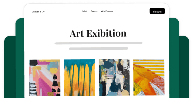
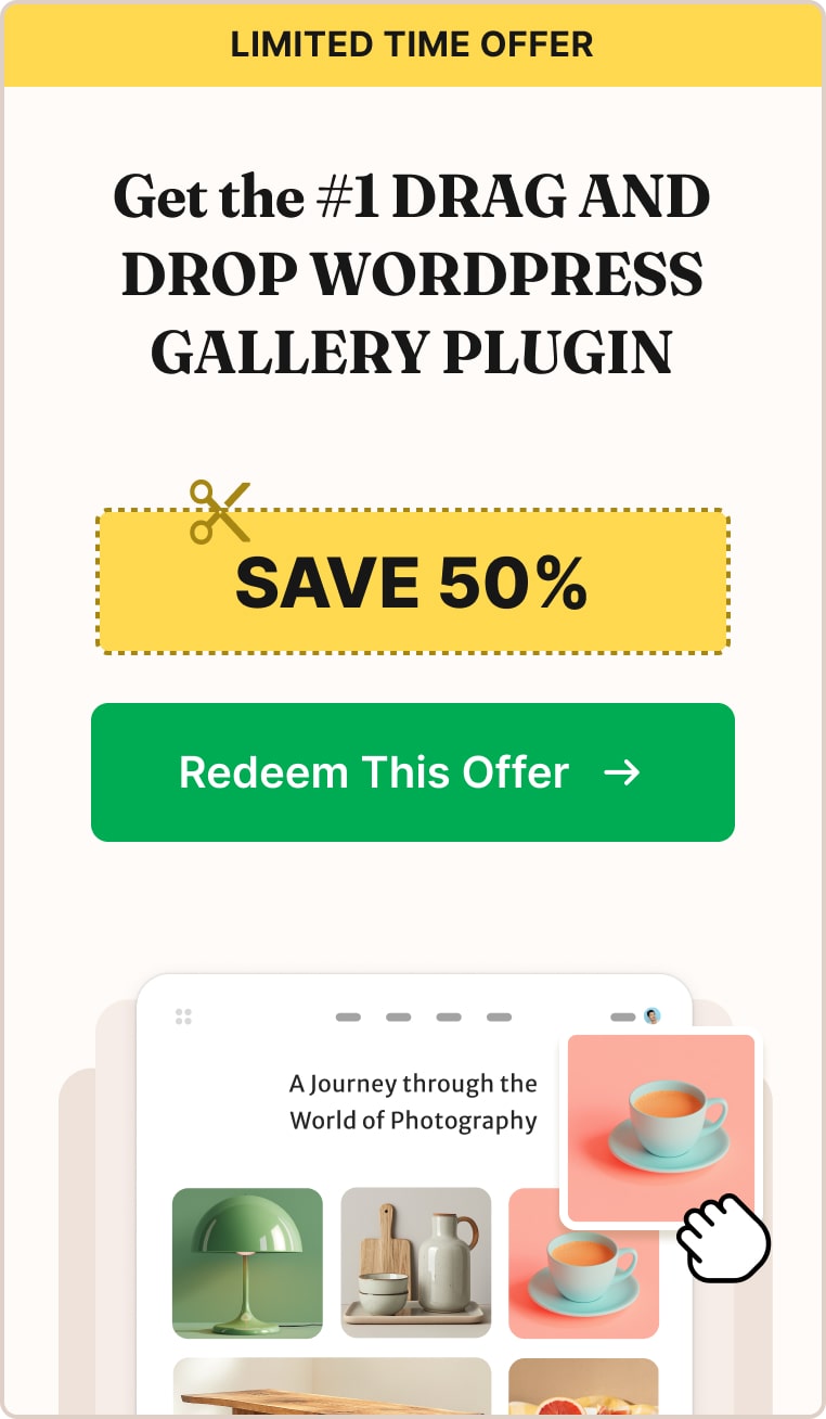
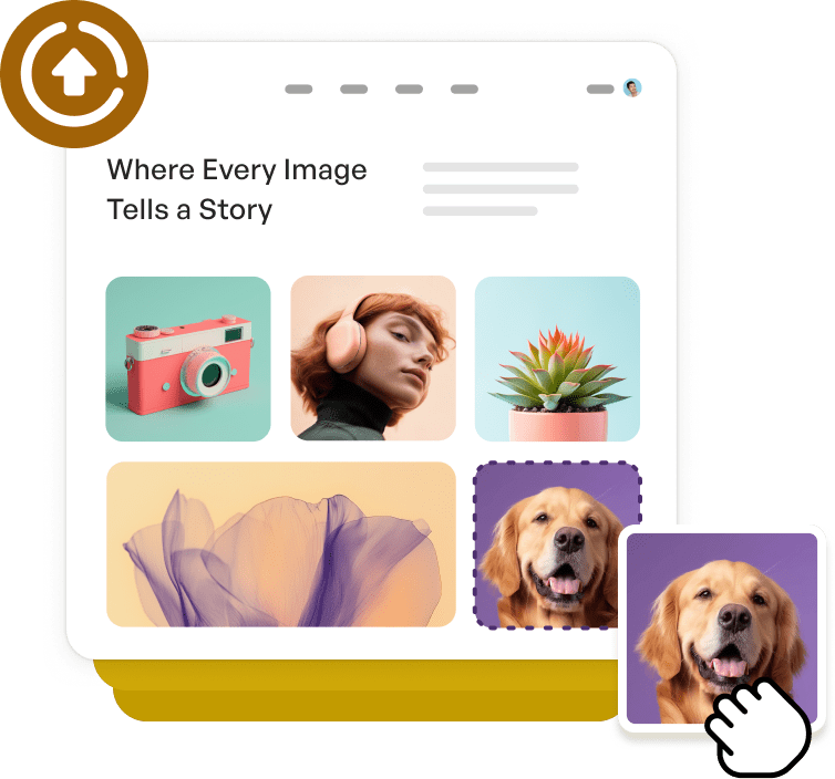
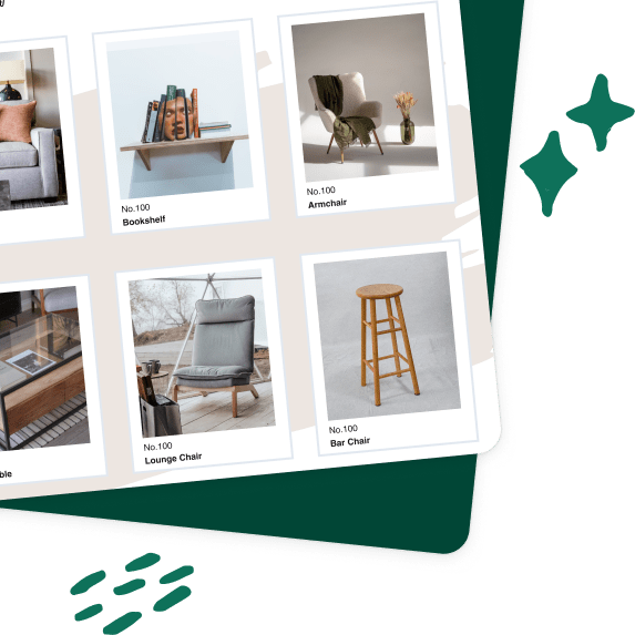
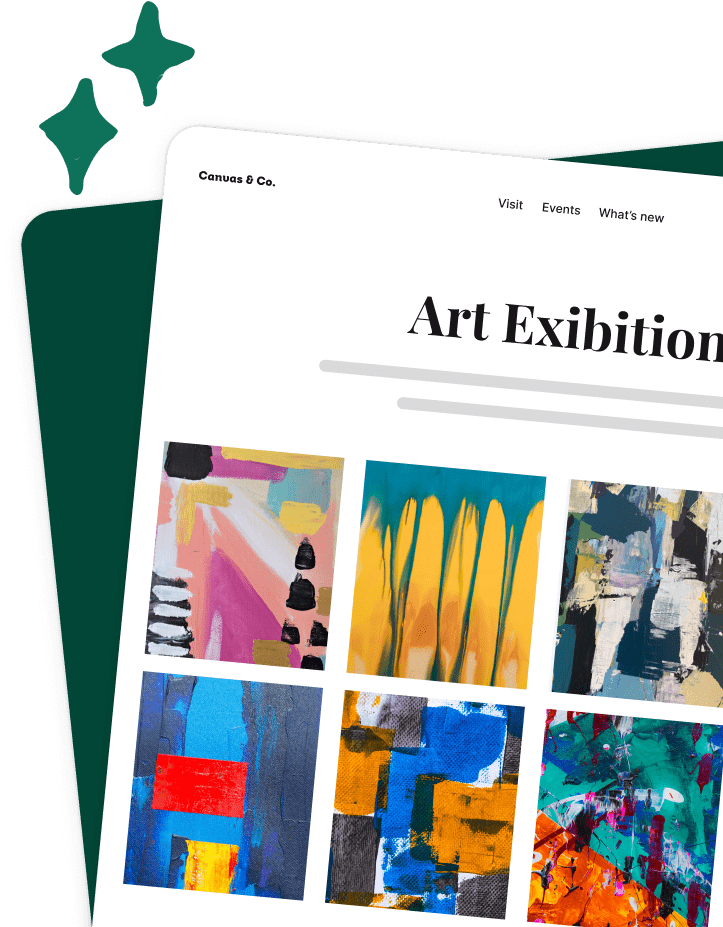
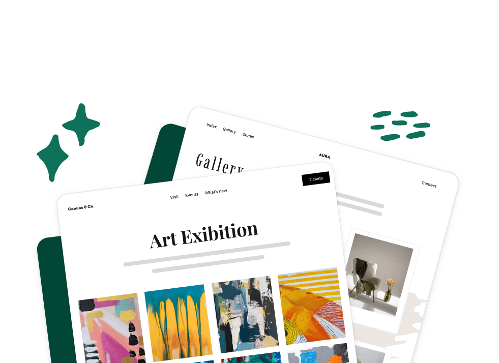
Managing Image Sizes with Envira Gallery
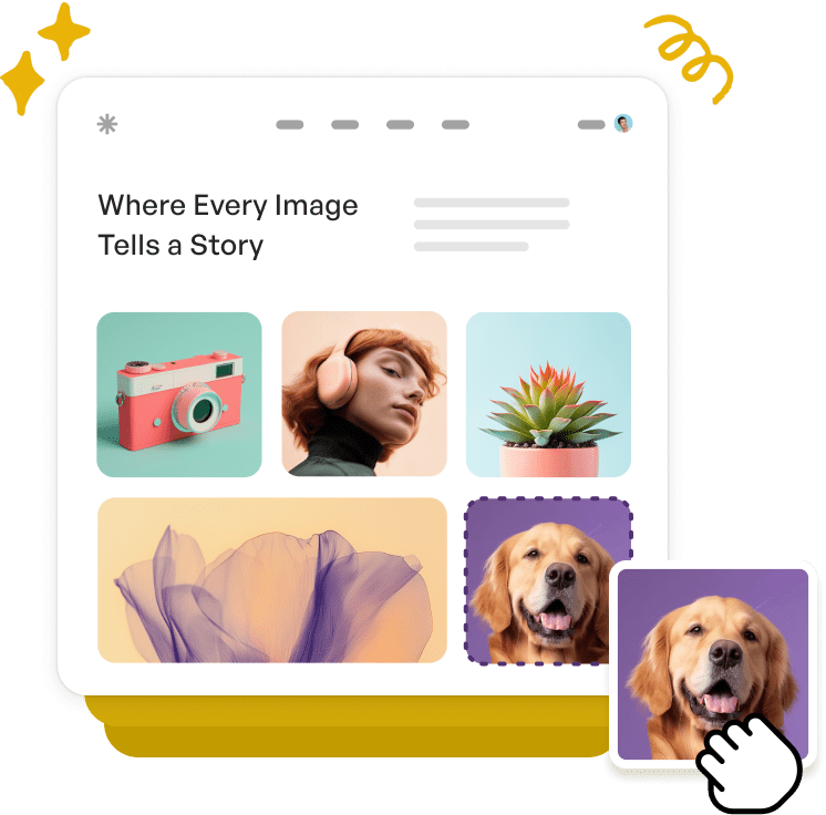
When it comes to managing galleries on your WordPress site, Envira Gallery is the perfect solution. With built-in features that automatically resize images for different screen sizes and layouts, Envira Gallery helps maintain a consistent, professional look without the hassle of manual resizing.
Key Features:
- Responsive design that adapts to all screen sizes
- Customizable gallery layouts
- Built-in image compression, lazy loading, and SEO features
- Automatic, customizable image resizing or cropping for gallery images, thumbnails, and mobile devices while preserving original images for downloads and other uses.
- Built-in lightbox display, including the option to display images at full resolution for better viewing
Envira Gallery ensures your images look their best, regardless of the screen or layout. Whether you’re creating photo galleries, portfolios, or client albums, you have complete control over how your images are displayed.

Envira Gallery also offers advanced features like eCommerce integration, social sharing, animations, image tagging, and more.
See Envira Gallery’s Features →
We hope this article helped you better understand WordPress image sizes. The correct ratios and sizes are crucial for achieving a polished, professional look while maintaining fast load times and optimal performance.
By understanding the default sizes and ratios, customizing dimensions to fit your theme, and using tools like Envira Gallery, you can ensure your images are displayed beautifully across all devices.
If you enjoyed learning what size images to use on WordPress, check out How Quickly Edit Images in WordPress.
Not using Envira Gallery? Get started today!
Don’t forget to check out our blog and follow us on X (Twitter) for the best photography tips, resources, and WordPress tutorials.


