I’ve watched countless websites struggle with slow loading times, and nine times out of ten, the culprit is unoptimized images. In my experience helping business owners speed up their sites, I can tell you that learning how to optimize images for web performance is one of the most impactful things you can do.
Images that load slowly, take up too much space, or don’t display correctly on mobile can frustrate visitors and hurt your SEO efforts. The average web page load time is 2.5 seconds on desktop and 8.6 seconds on mobile, and if a page takes longer than 3 seconds to load, 53% of mobile visitors will leave. That’s a lot of lost opportunities.
I’ve spent years optimizing images for websites, and trust me—preventing the problem is much easier than trying to recover lost traffic and rankings after the fact.
In this guide, I’ll show you exactly how to optimize images for web performance while maintaining visual quality. From choosing the right file formats to using automated tools, you’ll learn actionable strategies to serve optimized images efficiently across all devices.
In This Article
- What Is Image Optimization?
- Why Image Optimization Matters
- The 3 Key Elements of Image Optimization
- Advanced Image Optimization Techniques
- How to Optimize Images for WordPress with Envira Gallery
- Manual Image Optimization Tools
- Frequently Asked Questions
- How much do image file sizes really affect website speed?
- How do I optimize images for a website without losing quality?
- Does WordPress automatically optimize images?
- Can I optimize images already uploaded to WordPress?
- Should I optimize images before or after uploading to WordPress?
- What's the difference between JPEG and PNG for web images?
- Should I use WebP format for my WordPress images?
- What is the best image size for WordPress websites?
- What DPI should I use for website images?
- How many images should I use in a web gallery?
- Wrapping Up
What Is Image Optimization?
Image optimization is the process of modifying and delivering high-quality images in the most efficient format and resolution for the device accessing them. The key is keeping the file size as small as possible without compromising the image quality. It also involves selecting the appropriate file format, adjusting dimensions, and considering metadata like image titles and ALT tags.
You can manually optimize images using compression software and photo editing tools, or you can use plugins to automate your image optimization on WordPress.
Why Image Optimization Matters
Image optimization has a massive impact on SEO (search engine optimization). When Google crawls and ranks websites, it looks for properly formatted images as a marker of high-quality content. Plus, speed and mobile responsiveness are major ranking factors for search crawlers.
According to the HTTP archive, images make up 42% of an average web page’s total weight, which makes them the second heaviest item on a web page after videos.
Here’s what really drives this home: a 1 second delay can cause 11% fewer page views, conversion rates to drop by 7%, and a 16% decrease in customer satisfaction. Readers will often bounce from slow sites, and a high bounce rate can indirectly hurt your SEO.
47% of customers expect a website to load in 2 seconds or less
64% of smartphone users expect pages to load in 4 seconds or less
53% of mobile visitors leave if a page takes longer than 3 seconds to load
1 second delay causes 7% less conversions
1 second delay causes 16% decrease in customer satisfaction
1 second delay causes 11% loss in page views
Long story short—optimizing your images for SEO, fast load times, and mobile display is extremely important.
The 3 Key Elements of Image Optimization
Optimizing images for the web is all about minimizing load times without impacting image quality. By following a few simple techniques, you can maintain the quality of your photos while reducing file sizes up to 80%.
Let me break down the 3 primary things that contribute to image optimization.
1. Choosing the Right File Format
When you take a picture with a camera or create an image on your computer, there are several formats you can use to save it. Many cameras allow you to save images in RAW format, which preserves all the data from the camera sensor, offering the highest quality.
As you may have guessed, though, these large files take up significant storage space and bandwidth, making them inefficient to serve on a web page. To optimize image loading times without sacrificing too much quality, web designers use various file formats, each suited for different types of content.
It’s key to use the right file format for the job. Here are the most common image formats used for the web:
| FORMAT | BEST USE CASE |
|---|---|
| JPEG (.jpg) | The standard image format for most web pages. A JPEG file is compressed to retain information about color and shading while reducing file size significantly. However, JPEG files may lose image quality if they’re compressed too much. |
| PNG (.png) | A form of lossless compression. Unlike JPG, you won’t lose any quality with PNG compression. Perfect for images with transparency, logos, or images with text. |
| SVG (.svg) | Vector-based format perfect for logos, icons, and simple graphics. Infinitely scalable without quality loss and typically very small file sizes. Can be styled with CSS and made interactive. |
| WebP (.webp) | A modern format developed by Google that provides superior compression. WebP images are 26% smaller in size compared to PNGs and 25-34% smaller than comparable JPEG images. |
| AVIF (.avif) | The newest format with excellent compression. Often 50% smaller than comparable JPEGs, but browser support is still growing. |
| GIF (.gif) | Best for simple images with few colors and animations. Uses lossless compression but limited to 256 colors. |
Several other image formats exist for other use cases, but most website users require some combination of the ones above. For example, HEIF offers excellent compression but is only compatible with newer MacOS and IOS operating systems. Meanwhile, TIFF and BMP are excellent for storing high-quality images but aren’t recommended for web use.
In general, JPEG remains the go-to for photography and other images. They’re lightweight and usually still look good, even with compression. For logos, SVG is the preferred choice. For photos with text or transparency, and other complex images, stick with PNG files.
To further optimize performance, many web designers are now shifting toward WebP for the majority of image content and AVIF when the smallest file size with the highest image quality is required. These modern formats offer several advantages over traditional JPEG and PNG:
- Superior compression with minimal quality loss (AVIF offers even better compression than WebP)
- Flexible options supporting both lossy and lossless compression
- Advanced features like transparency, animation, and HDR (High Dynamic Range)
- SEO benefits from faster load times, since Google considers page speed a ranking factor
If opting for newer formats, make sure to provide fallback options to ensure all browsers can serve your images.
2. Image Compression Techniques
Aside from selecting a file format, one of the first steps you’ll want to take for optimizing images is compressing the image so that it loads faster on display.
Images are composed of bytes of data that refer to specific colors on a per-pixel basis. The image data tells an image interpreter what color to display on each pixel, which is then translated to an image on a screen. Image files with more complex color data produce more detailed and rich images but are typically much larger.
Websites load quicker when the images have file compression, which removes superfluous information from a raw image file. Some forms of file compression can degrade image quality, but many tools do a great job of retaining image quality while reducing large file sizes.
Depending on the compression software you’re using, you’ll often have control over the level and type of compression. There are 3 main types of image compression:
- Lossless Compression – Reduces file size without any quality loss. Perfect for images where every detail matters.
- Lossy Compression – Removes some image data to achieve smaller file sizes. Quality decreases slightly, but file sizes can be dramatically reduced.
- Hybrid Compression – Combines both techniques, applying lossless compression to important areas and lossy to less critical sections.
Here’s an example of automatic image compression at different levels. The original photo was a whopping 8.4 MB!

3. Proper Image Sizing and Dimensions
One of the biggest problems that photographers have when it comes to uploading pictures on their website is that they forget to scale images down before they upload.
It’s tempting to simply snap a picture, edit it, and upload it to WordPress, where you can use the ‘edit’ function to cut the image down to size. Unfortunately, this doesn’t reduce the amount of effort needed to load the image in the first place. Despite only showing a fraction of the picture to viewers, WordPress loads the whole file every time someone opens the page.
To eliminate this problem, resize images to reduce large dimensions before you upload them to your website. For example, we took a JPEG image that was 4272 x 2848 with a file size of 4.25 MB and resized it to 1200 x 800. The resulting file size was 860 KB. That means we reduced the size by more than 80% just by scaling the dimensions!
Advanced Image Optimization Techniques
The techniques we’ve covered so far are the main factors that makeup image optimization. However, there are a number of other techniques that can improve website speed and boost image SEO.
Pro Tip: If you’re worried about load times on a specific URL, you can use Google’s Pagespeed Insights to see how a individual pages perform.
Responsive Images and Adaptive Delivery
Modern websites need to serve images that look great on everything from smartphones to large desktop monitors. This is where responsive images come in. By using HTML’s srcset attribute, you can provide multiple versions of the same image at different sizes, and the browser will automatically choose the most appropriate one.
Content Delivery Networks (CDNs)
A CDN stores copies of your images on servers around the world, so when someone visits your site, they get images from the server closest to them. This can dramatically reduce loading times, especially for international visitors.
Setting up a CDN used to be complicated and expensive, but modern solutions make it simple. If you’re looking for a WordPress-specific solution, Envira CDN offers lightning-fast image delivery with just one click. It automatically optimizes and serves your WordPress images through a global network, reducing load times by up to 50% without any technical setup required.
Lazy Loading Implementation
Lazy loading means images only load when they’re about to come into view as a user scrolls. This technique can significantly improve initial page load times, especially on image-heavy pages.
Caching Plugins
Caching is the technique of taking dynamic content from a server and making it static. This helps speed up WordPress sites because it minimizes database requests, which speeds up page loading times. A good caching plugin works hand-in-hand with image optimization to create lightning-fast websites.
Image Metadata and SEO
Adding titles, captions, and alt tags is extremely important for SEO. Alt tags tell Google what your image is about so they can be indexed correctly. They’re also a great way to add more keywords to the page’s HTML content. Every image on your site should have descriptive alt text that helps both search engines and users with disabilities understand your content.
XML Sitemaps for Images
Sitemaps are blueprints of your site. They show what pages link to one another, what kind of content they include, and how the structure of the site works. These maps make it that much easier for Google to understand your site and the individual pages. It also helps optimize image indexing because it tells Google when you add new photos to your WordPress site and what topics they’re associated with.
Social Media Tags
Social media tags help define how an image and its related metadata (alt tags, captions, etc.) show up when shared on social media networks. Google sees this as a good form of site optimization, and it helps make your content attractive across multiple platforms. Proper Open Graph and Twitter Card tags ensure your images display correctly when shared.
WordPress Theme Optimization
Theme images, like your logo and background, load automatically. While it may not be a huge contributor, it’s worth noting that a poorly designed theme can have a serious impact on how well your site performs. Choose themes that are optimized for speed and properly handle image loading.
How to Optimize Images for WordPress with Envira Gallery
If you have a photography portfolio or image-heavy website, you’ll be thrilled to know that Envira Gallery includes built-image compression, lazy-loading, and plenty of other gallery optimization tools.
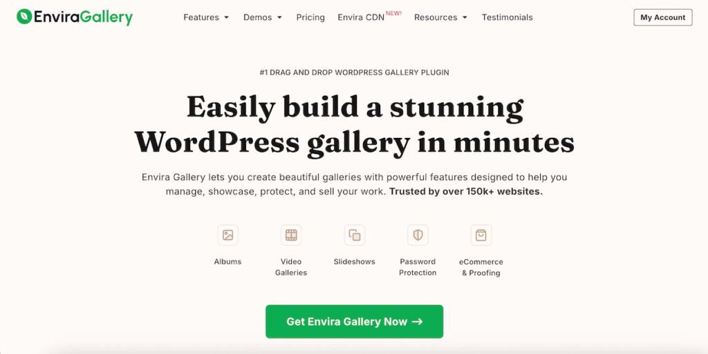
Envira Gallery is the best WordPress gallery plugin, allowing you to create beautiful image and video displays with multiple layouts, including slideshow, fullscreen, masonry, lightbox display, and more.
Envira Gallery is already the fastest image gallery plugin available, but let’s take a look at a few of the plugin’s extra features for WordPress image optimization.
Built-in Image Compression
Envira Gallery Pro comes with a super handy image compression tool that lets you automatically compress all the photos in your galleries or even your entire WordPress media library. Just head to Envira Gallery » Settings and click the Image Compression tab.
You can enable automatic compression for Only Envira Gallery Images or All Media Library Images, select the level of compression (Lossy, Glossy, or Lossless), and choose which image dimensions to apply compression to.

Automatic Image Resizing
Aside from compression, Envira Gallery helps with image dimensions, letting you automatically resize photos on a per gallery basis. You can even set different image sizes for the gallery vs. lightbox view or crop images to fit a uniform size. That way, you know your photos are perfectly sized for their purpose.
For example, there’s no need to display fullsize gallery images that take longer to load when you’re using a lightbox. Set thumbnails or smaller images to display in the gallery and let users view the bigger version in the lightbox.
Lazy Loading for Faster Performance
Envira Gallery’s lazy loading feature is built-in to the core plugin and available to everyone, no matter what license you have. Lazy loading means that images on the page won’t load until the reader scrolls to them, which can drastically improve page speed.
Lazy loading is automatically enabled for every new gallery you create. Just edit a gallery and select the Configuration tab. Then, check the Enable Lazy Loading option. You can even customize the loading delay when your visitors scroll.
Gallery Pagination
Envira Gallery’s Pagination Addon lets you split your gallery into multiple pages to improve load time and user experience. This is a huge help for websites that have large galleries. Aside from increasing page speed, it also boosts engagement by encouraging users to click the next page of your gallery.

Mobile Optimization
All galleries created with Envira are completely responsive and mobile-friendly. Whether your visitors view your website on a desktop, laptop, tablet, or smartphone, your galleries will always look great. You don’t need to touch a single line of code to ensure that your photo galleries work across all browsers.
Envira Gallery adapts to the settings you select and dynamically generates a mobile-friendly gallery. However, if you want to take your mobile image optimization even further, you can add custom settings for galleries displayed on mobile. For example, you can set specific dimensions for mobile images, adjust mobile lightbox settings, and more.

Aside from all these features that help you optimize images for WordPress, Envira Gallery also offers deep linking to improve image SEO, breadcrumbs for better navigation, social sharing buttons on photos, watermarking, and lots more!
Optimize Your WordPress Images with Envira Gallery today!
For even faster image delivery, consider pairing Envira Gallery with Envira CDN – a standalone plugin that serves your images through a global content delivery network for lightning-fast loading times worldwide.
Manual Image Optimization Tools
If you prefer to optimize images before uploading to WordPress, here are several excellent tools that make the process simple and efficient:
Online Tools:
- TinyPNG – Excellent for quick compression of PNG and JPEG files
- Squoosh (by Google) – Advanced compression with real-time previews
- Compressor.io – Supports multiple formats with lossless and lossy options
Desktop Software:
- Adobe Lightroom – Professional batch optimization with excellent quality control (integrates with Envira Gallery!)
- Adobe Photoshop – Professional standard with ‘Save for Web’ feature for precise optimization control
- GIMP – Free, open-source Photoshop alternative with good optimization features
- ImageOptim (Mac) – Drag-and-drop optimization tool
- RIOT (Windows) – Radical Image Optimization Tool with batch processing
- XnConvert (Cross-platform) – Batch conversion and optimization
Pro Tip: For developers, ImageMagick offers powerful command-line batch processing capabilities.
While these tools work well for manual optimization, WordPress image optimization plugins are typically more efficient for ongoing image management since they automate the entire process.
Converting to Modern Formats: WebP and AVIF
Both WebP and AVIF formats provide advanced compression techniques that reduce file sizes significantly while maintaining high image quality. WebP enjoys broad browser support across Chrome, Safari, Firefox, Edge, Opera, and Android browsers. AVIF is slightly newer but gaining traction, and as of August 2024, Google Search supports AVIF, which is great news for SEO!
You can convert images to WebP or AVIF using various tools, from WordPress plugins to online converters or desktop software. WordPress plugins like ShortPixel, Imagify, and WP Rocket automatically serve WebP or AVIF images to browsers that support them while keeping JPEG/PNG images for others.
You can also serve WebP or AVIF images using .htaccess rules or the HTML <picture> tag to provide fallback options for older browsers. This ensures that your website delivers optimized images for all users, whether they’re on modern browsers that support WebP and AVIF or older browsers requiring JPEG/PNG fallback options.
Frequently Asked Questions
How much do image file sizes really affect website speed?
Significantly. From a 1 to 3 second page load time, the probability of a bounce increases 32%, and from a 1 to 5 second page load time, the probability of a bounce increases 90%. Since images make up about 42% of an average webpage’s weight, optimizing them is crucial for performance.
How do I optimize images for a website without losing quality?
Choose the right balance between compression and quality. Start with 80% JPEG quality as a baseline – this typically provides excellent quality with significant file size reduction. For WordPress, use plugins like Envira Gallery, WP Smush, and ShortPixel that allow you to choose between maximum compression and maximum quality.
Does WordPress automatically optimize images?
Not really. WordPress automatically creates three new versions of every uploaded image to different dimensions (thumbnail, medium and large) but it won’t compress images for you or help you reduce their file size. You’ll need a plugin or manual optimization for true image optimization.
Can I optimize images already uploaded to WordPress?
Yes! A WordPress plugin is the best way to optimize images already in your media library. Plugins like Envira Gallery, WP Smush, and ShortPixel can bulk-optimize existing images. You can also use online tools like TinyPNG or Squoosh to manually optimize individual images.
Should I optimize images before or after uploading to WordPress?
Either approach works, but I recommend optimizing before upload when possible. This saves server space and ensures you’re starting with the best possible files. However, if you have many existing images, use a plugin to bulk-optimize your media library, then switch to pre-optimization for new uploads.
What’s the difference between JPEG and PNG for web images?
JPEG is best for photographs and images with many colors – it provides good compression with acceptable quality loss. PNG is better for images with transparency, text, logos, or graphics with few colors – it uses lossless compression but results in larger file sizes for photos.
Should I use WebP format for my WordPress images?
WebP images are 26% smaller in size compared to PNGs and 25-34% smaller than comparable JPEG images, and WebP is now supported by 97% of browsers. It’s an excellent choice for reducing file sizes while maintaining quality, especially when you provide fallback images for older browsers.
What is the best image size for WordPress websites?
For blog images and content with text, aim for images under 100 KB. For portfolio galleries and larger images, target a maximum of 2,000px wide or 1,500px tall with file sizes around 500 KB. The key is matching the image dimensions to how they’ll actually be displayed on your site.
What DPI should I use for website images?
DPI (dots per inch) actually doesn’t matter for web images! DPI refers to dots per inch, specifically the number of ink dots used to print a photo, and PPI (often used interchangeably) refers to the number of pixels per inch that are displayed for digital images. But the truth is, screens aren’t measured in inches, so PPI and DPI are both irrelevant to website images. The only thing that matters for online photos is the absolute pixel dimensions.
In fact, editing programs like Photoshop discard any DPI information entirely when you optimize an image for the web. So, why do people say that 72 pixels per inch (ppi) is best for web or screen resolution? Short answer… it’s a myth. It did have relevance at one point in history, but technology changed, and that time is long gone.
That said, if you allow users to print directly from your website or use a print service that pulls from your online gallery, you’ll want to keep DPI/PPI in mind when uploading images. If that’s the case, consider uploading your originals as the print source while serving a resized version for display.
How many images should I use in a web gallery?
When deciding the number of images for your gallery, consider your photography niche or business type. To maintain viewer engagement and prevent slow loading times, avoid exceeding 20 images on a single gallery page. Instead, focus on showcasing your best work within 10 to 20 images. For client delivery and proofing galleries, however, include as many photos as needed.
If you have a large gallery, consider creating a multi-page gallery with Envira Gallery’s pagination feature to help prevent slow loading. Or, If you photograph multiple styles, think about using an album with sub-galleries. This lets you better focus on the individual galleries and provides more content for your viewers to explore.
Wrapping Up
You made it to the end! As you can see, learning how to optimize images for web performance is important for all online businesses. You only have seconds to display your content to visitors, images and all, before they’ll bounce away.
WordPress users who rely on images as portfolio pieces or product photos should be especially focused on optimizing images for web performance.
Remember to use the right image format for all images, strike a compromise between image quality and compression, and use WordPress image optimization tools to minimize load times.
Envira Gallery combines the best photo management tools, powerful gallery-building, and superb WordPress image optimization into one streamlined plugin. Get it today!
If you enjoyed learning how to optimize images for the web, be sure to check out How to Sell Photos on WordPress (Beginner-Friendly).
Don’t forget to follow us on Facebook and X (Twitter) for the best photography tips, resources, and WordPress tutorials.









No mention of AVIF?
Good catch Erwin!
Although WordPress and most browsers support AVIF files, Google Search actually doesn’t support it (at least not yet). That means AVIF images can’t be indexed, can’t appear in Google Image Search, and Google won’t even analyze and index a video if the thumbnail is in AVIF format.
As you can imagine, all of that is bad for SEO. So for now, we recommend sticking to more widely supported formats when it comes to web images, but I’ll be sure to update the article if/when Google does start supporting AVIF. ?